Goodday guys!
If finally made my own commission guide. In the post below you can find out more about how to commission me, if commisions are open and you can view the prices. There is a new button in the top menu as well, where you can find the same information.
Commission Information
E-mail: evehartmanart@gmail.com
Website: evehartman.com
Instagram: evehartman
Etsy: evehartmanart
Commission status: OPEN
Thank you so much for your interest in my artwork! If you have any questions left after reading this guide, please, do not hesitate to ask anything. You can find my e-mail adress in the description above.
Notes:
I recommend you read my Terms of Service before commissioning anything. You will find these terms below the commission information.
Prices listed in this guide are in € (Euro) and they represent the minimum amount estimate.
This guide does not apply to commercial work, which means that the artwork I provide can only be used for personal purposes. If you are interested in commercial work, it would be most convenient to e-mail me.
I have to state that I will not draw any adult themed work. Artistic nudity and mild gore are both acceptable subjects.
Portrait
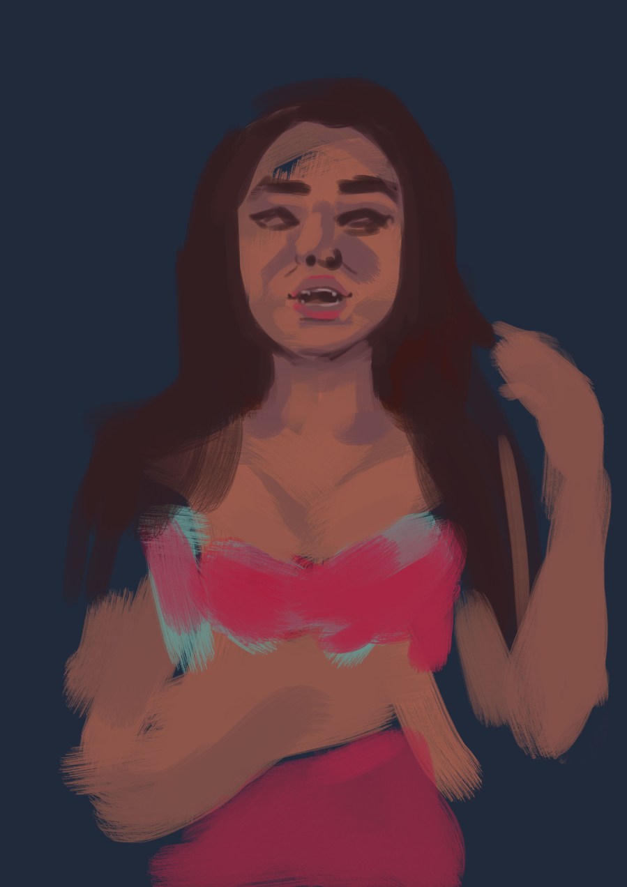
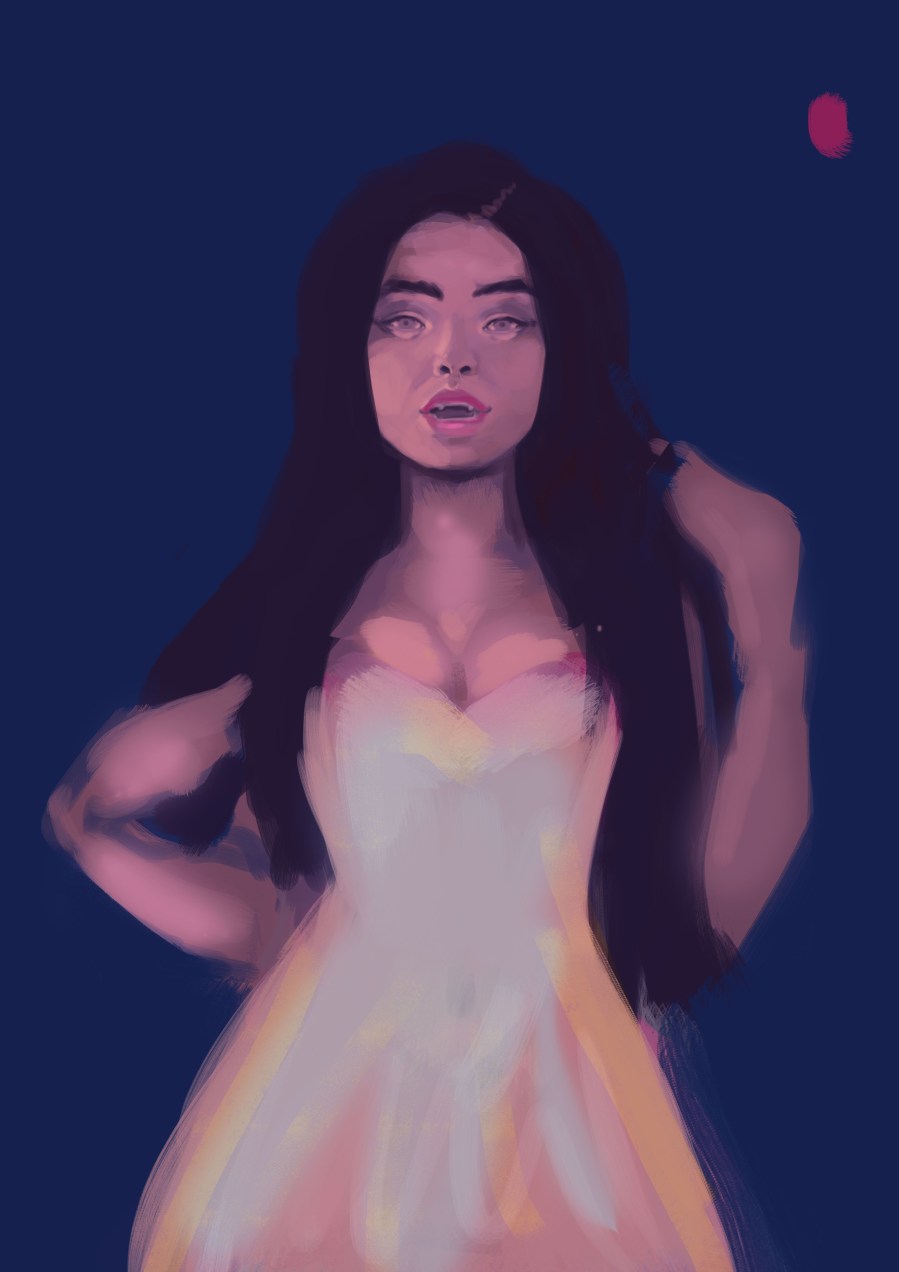
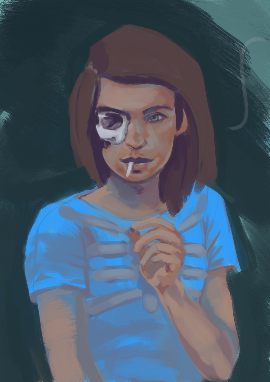
Simple – monochrome
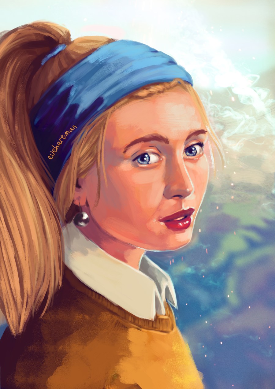
A simple portrait with a stylised background, in any colour you may prefer. My personal preference goes out to any blue hue.
Price estimate: €30 (starting price)
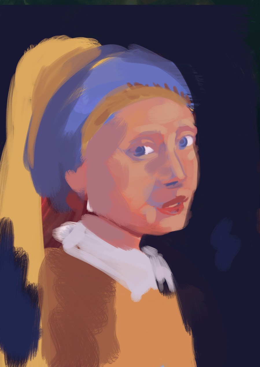
Simple – colour
Simple coloured portraits with a monochrome background. They can either have a smooth look or a textured one.
Price estimate: €40 (starting price)
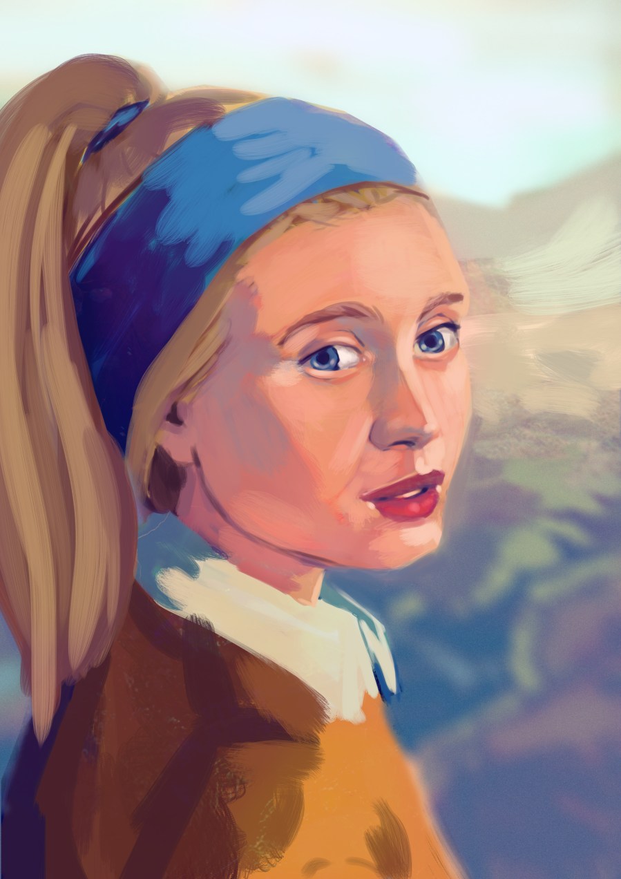
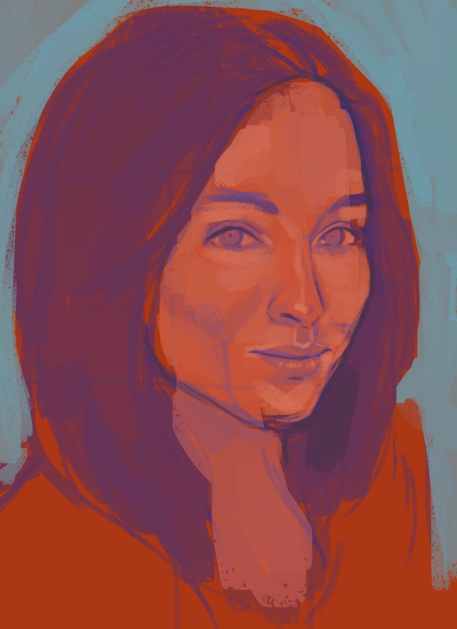
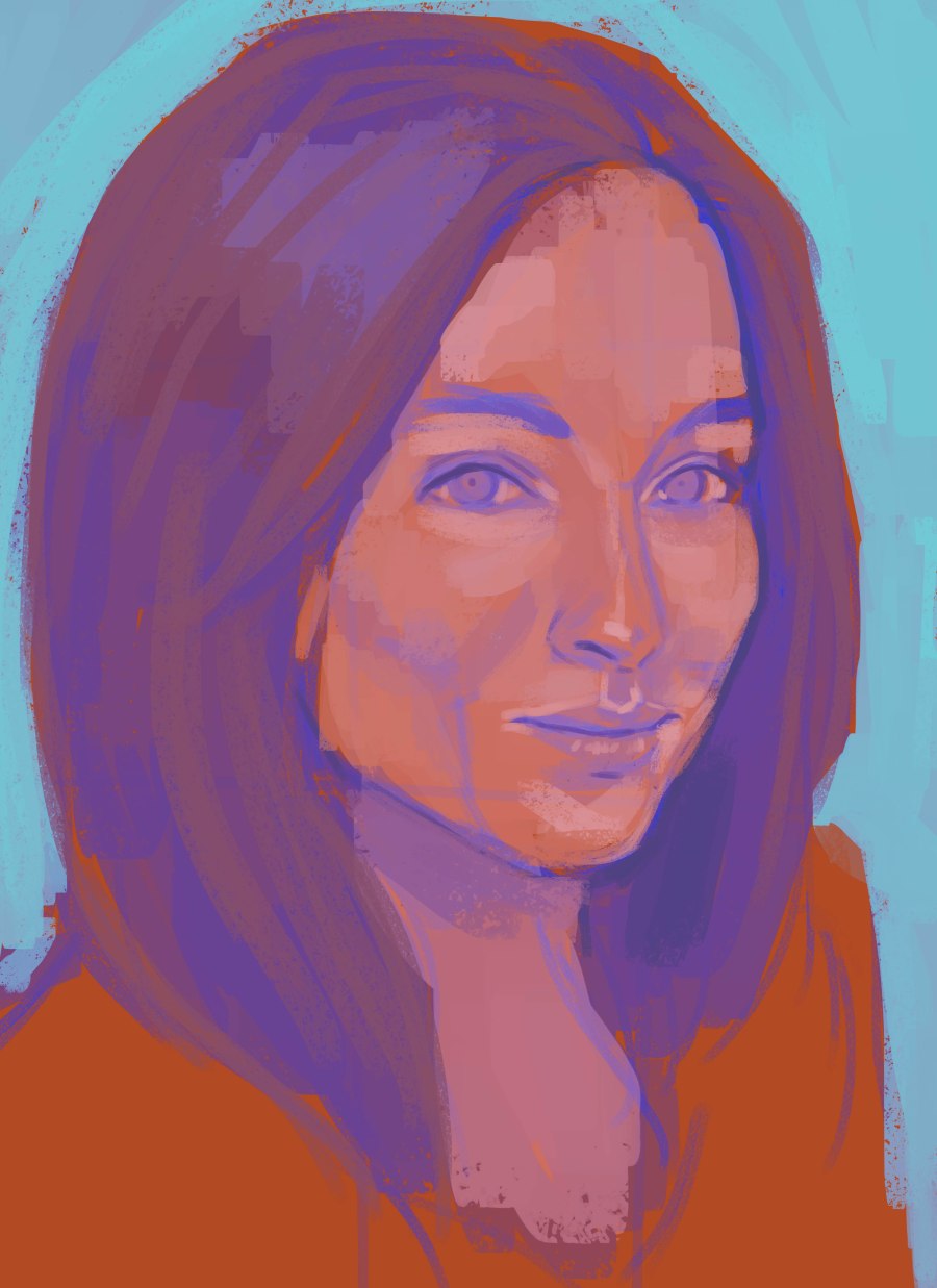
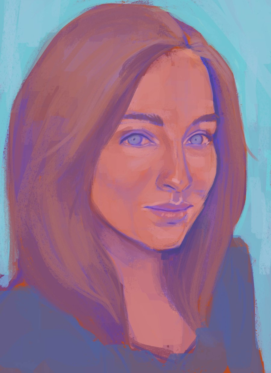
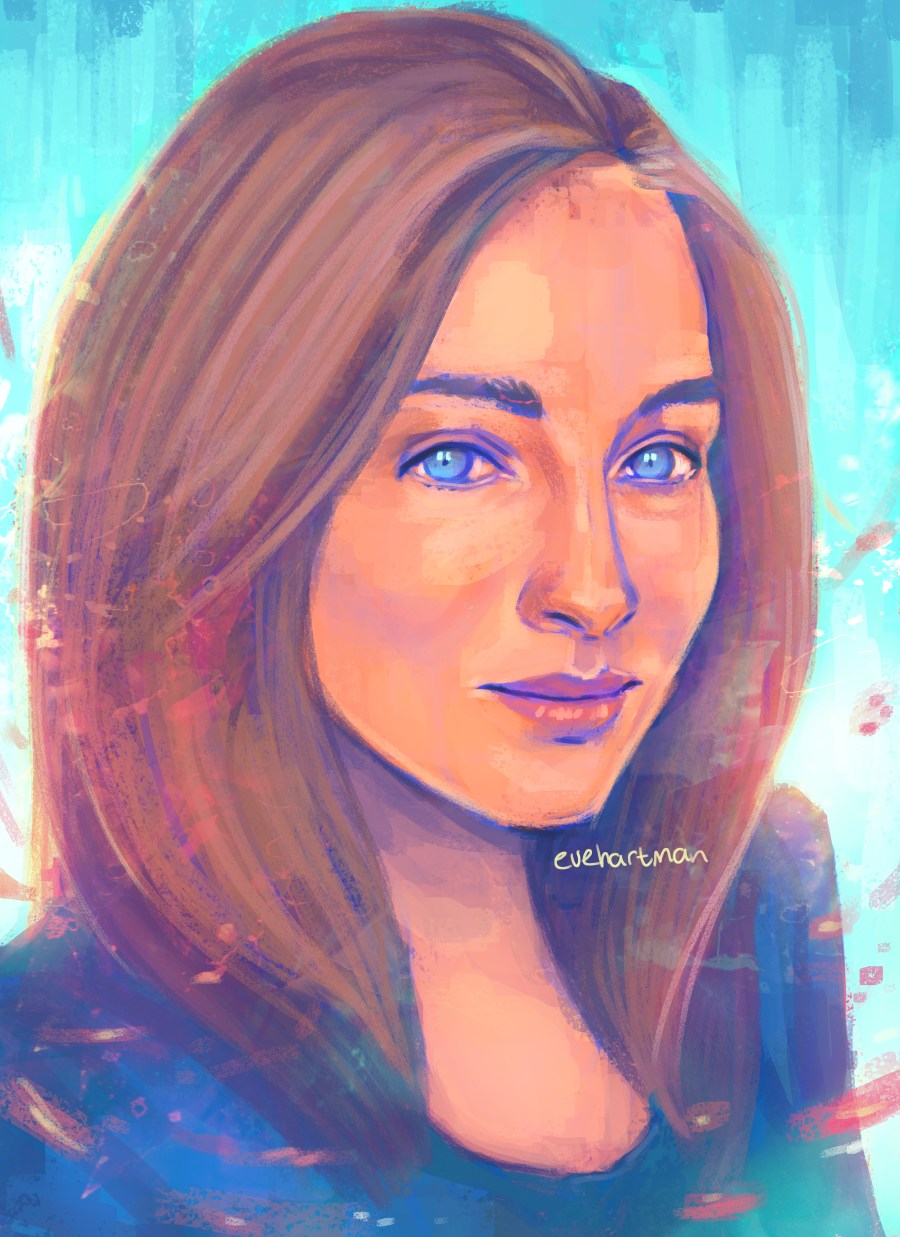
Detailed
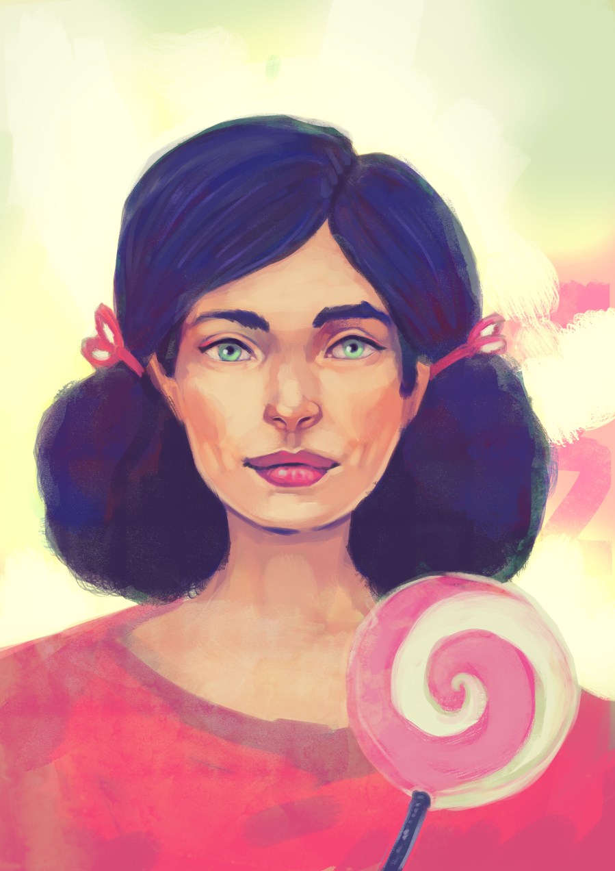
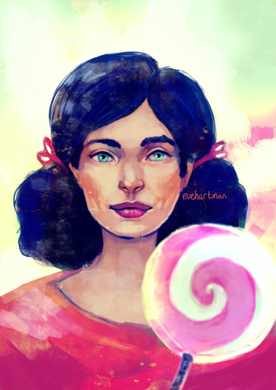
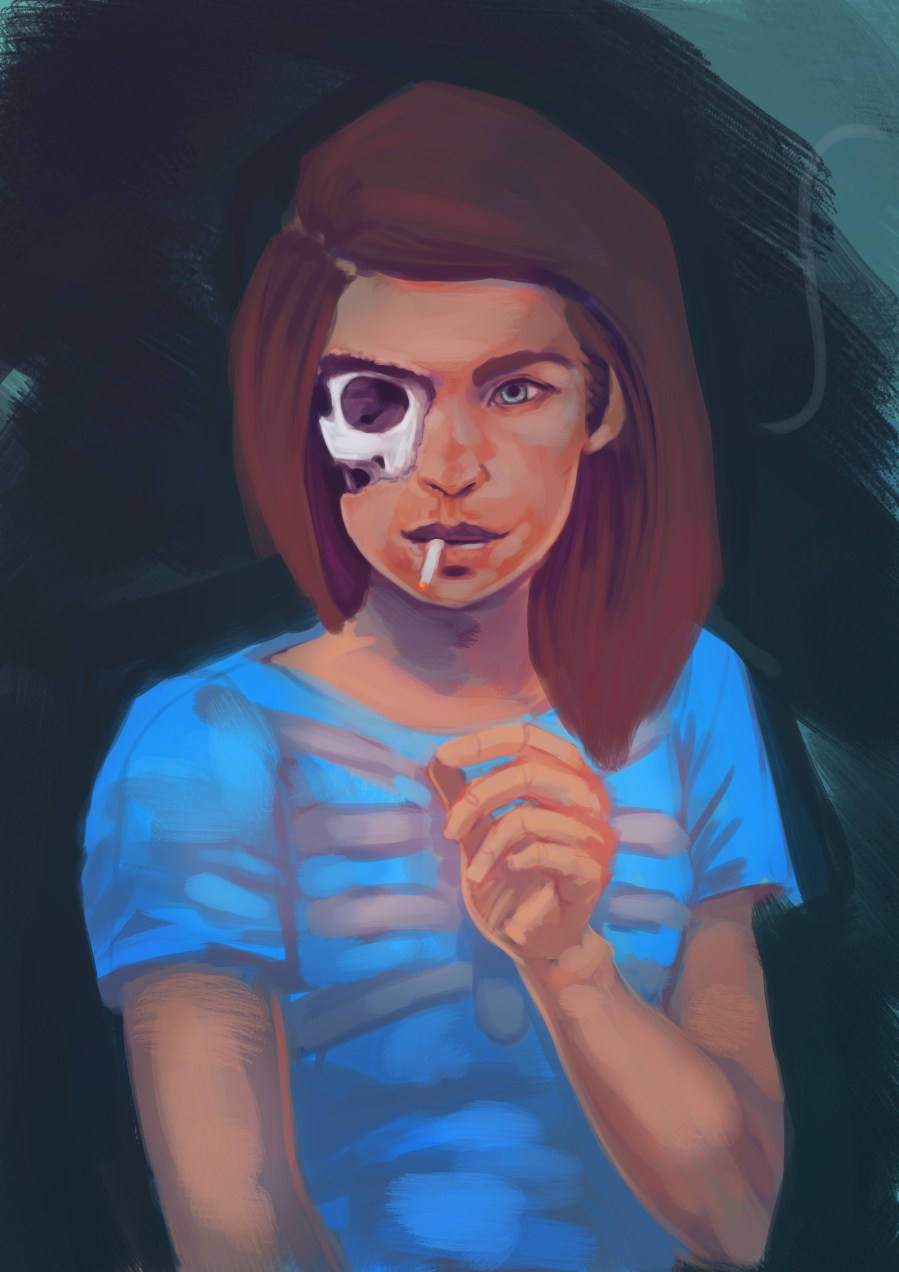
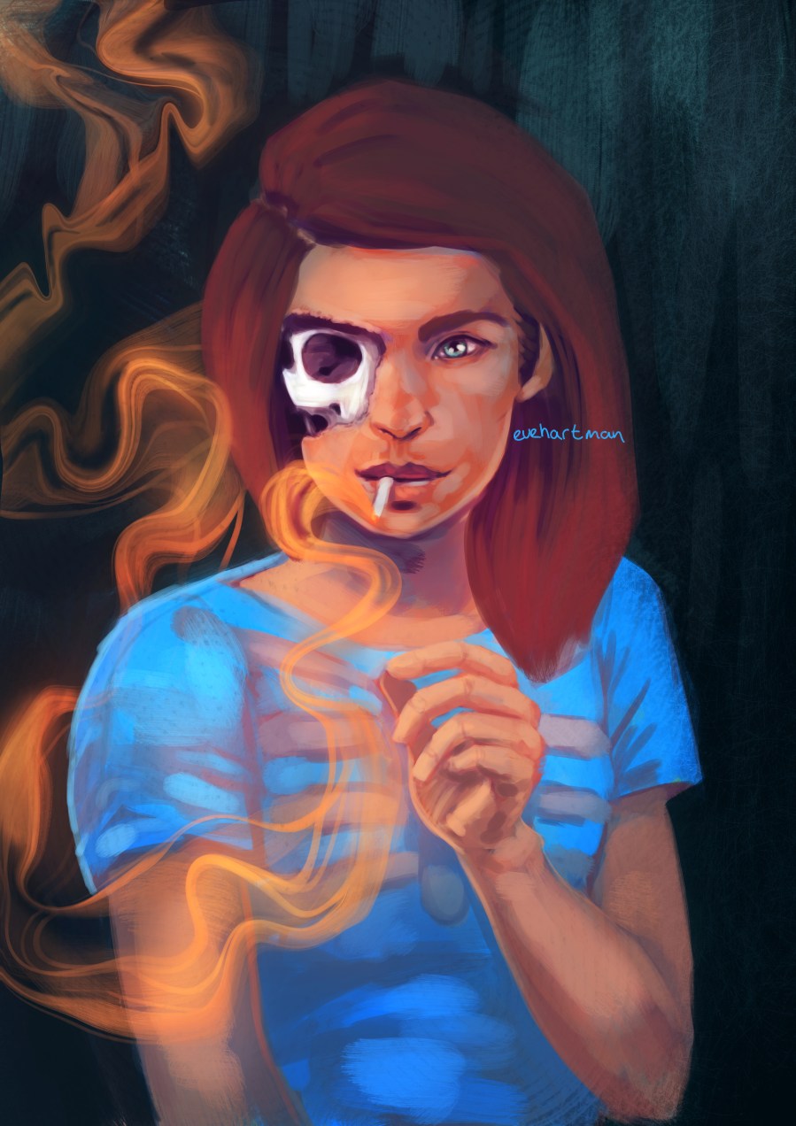
These portraits include a high level of detail and colourful compositions, as well as additional background lights.
Price estimate: €60 (starting price)
Illustration
Half body – simple background
Illustration with a simple background (low in detail, monochrome with some stylisation)
Price estimate: €80 (starting price)
Half body – detailed background
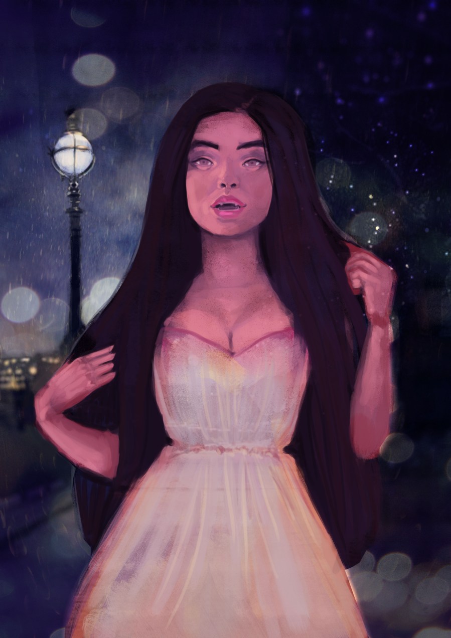
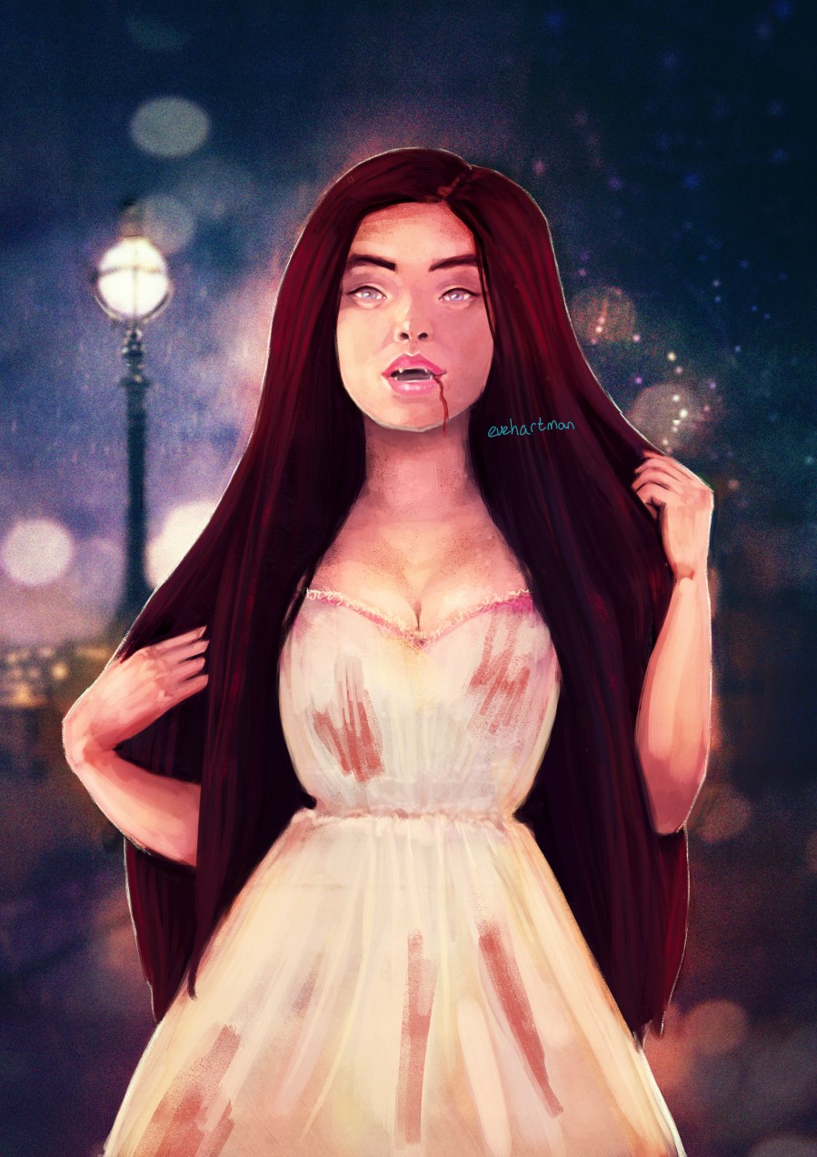
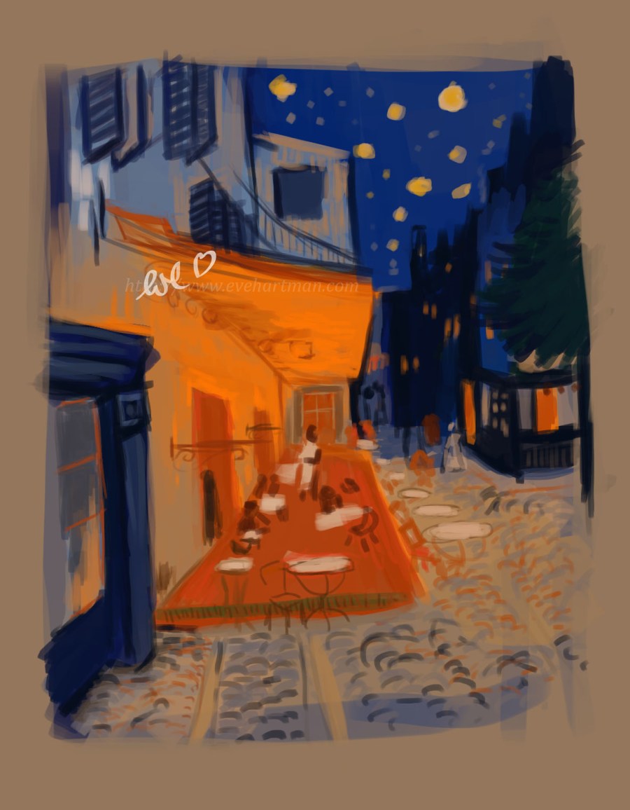
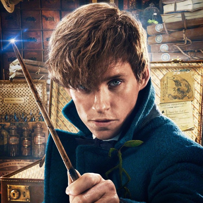
There is more attention to detail or stylisation in these illustrations. They can also contain more small subjects (i.e. the Athena drawing).
Price estimate: €90 (starting price)
Full body – simple background
Illustration with a simple background (low in detail, monochrome with some stylisation)
Price estimate: €100 (starting price)
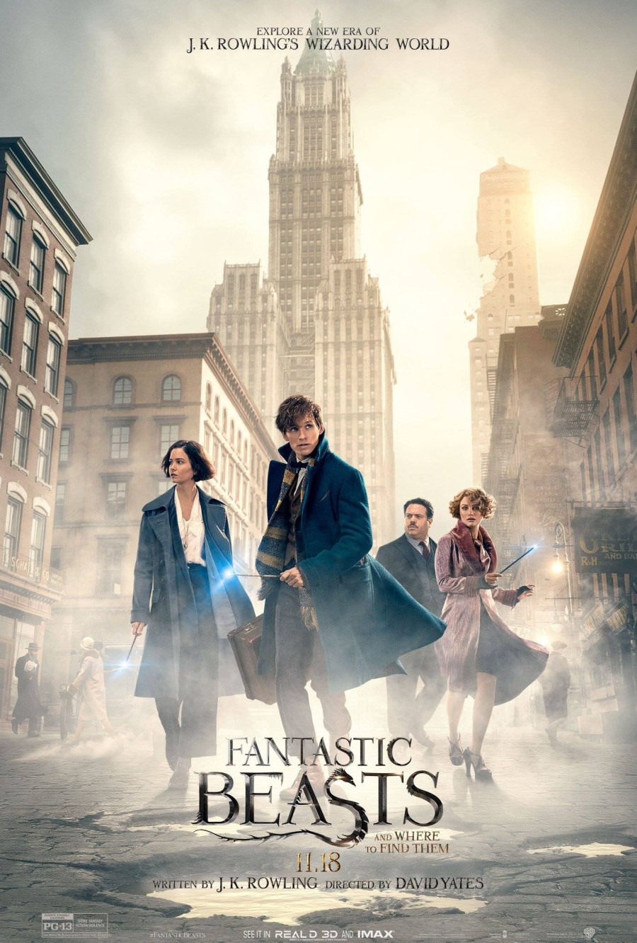
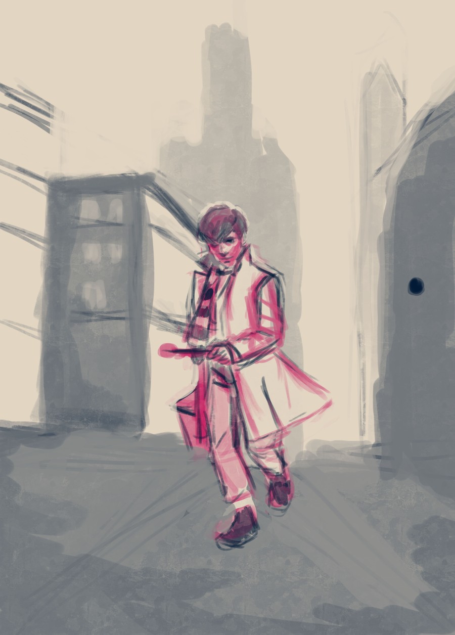
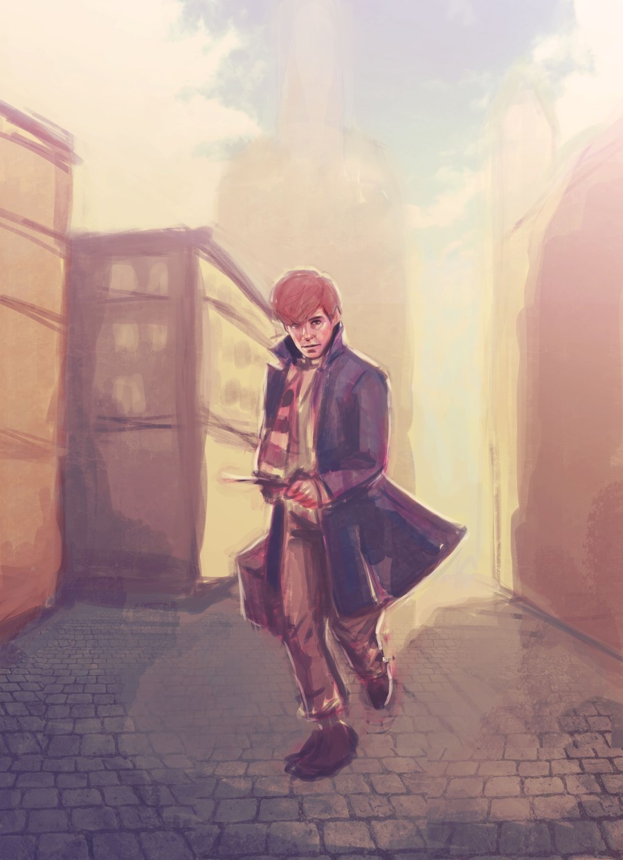
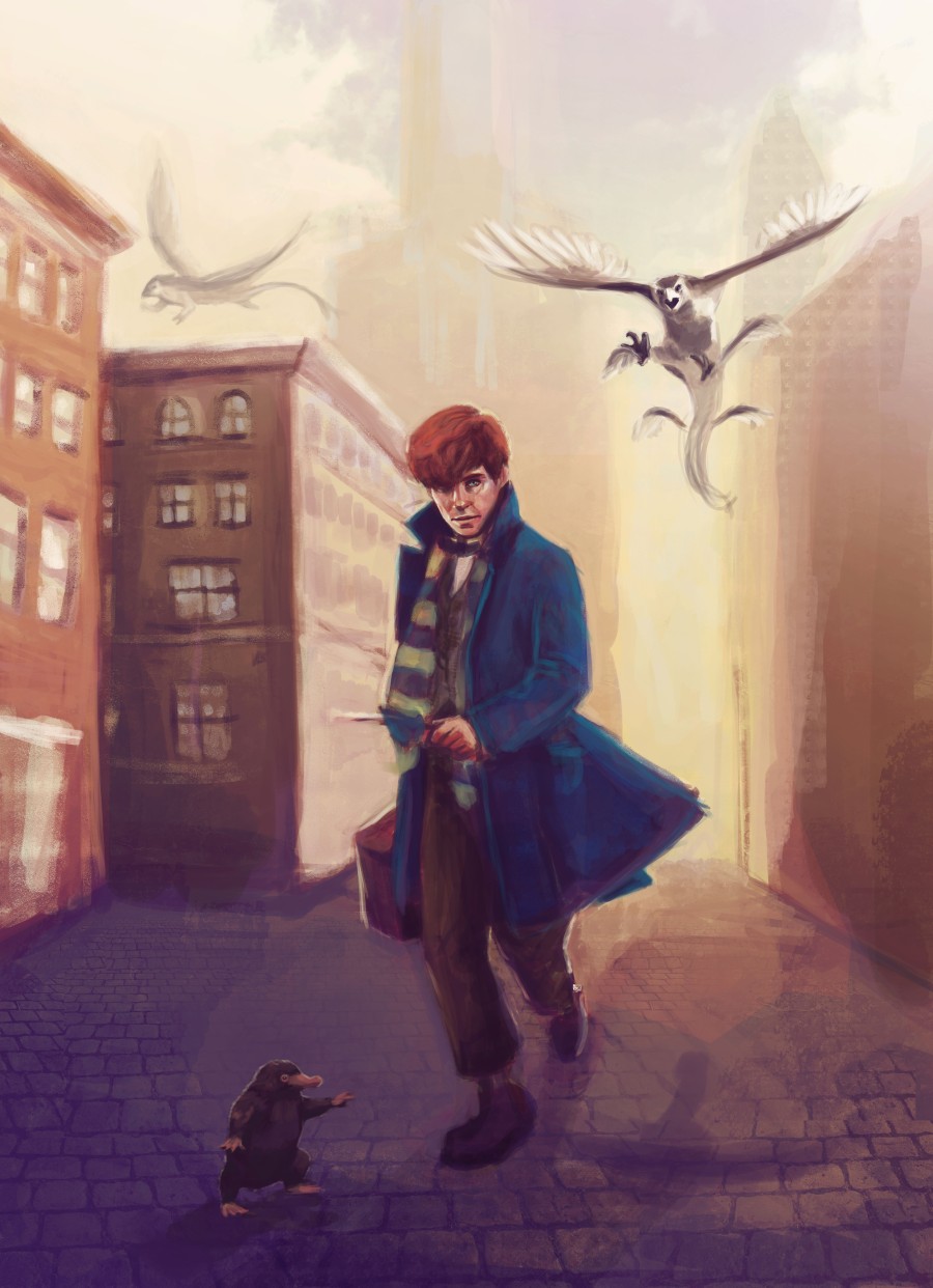
Full body – detailed background
These illustrations include a high level of detail, with detailed backgrounds as well. Prices can vary a lot, the price stated below is an estimate.

Art collaboration with Jake (jakobcreative on Instagram and Artstation)
Price estimate: €150 (starting price)
Rules
Commission me
To order, contact me at evehartmanart@gmail.com and use the template below to provide me with information.
Real name:
Social media username:
Email:
PayPal email:
Commission: Portrait (simple – monochrome/colour, detailed) – Illustration (halfbody – simple/detailed, full body – simple/detailed)
Description: (Discribe what you envision, add as much detail of what you want.)
References: (As part of the visualisation process, it really helps if you provide me with as much references as you can)
Composition elements: yes/no
Overall detail level: High/Medium/Low
Other Info (if any):
Workproces
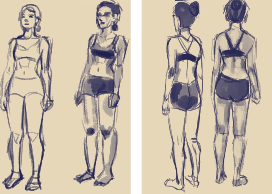
By hiring me you will get all of the things I listed above. Please make sure you mention any alterations you’d like made in the first few phases of this process. I work with a three-step plan:
- Sketch (Provide me with your notes/corrections, I will await your approval to continue)
- Colour Plan (a more complex and detailed sketch that includes colour planning)
- Full Resolution Final Image (in . JPG, unless you request another file type)

Terms Of Service
Process
- We must agree on a deadline beforehand
- I only accept payments through PayPal, using Euro (€) as currency
- Please provide me with a detailed subject description (with textual and visual references)
- Please make sure that you have all the needed permissions for the use of any character that is not your OC (original character).
- Characters from pop culture and media are accepted
- If there has been a misinterpretation during the artprocess, it is acceptable to change or alter the commissioned image to your liking.
Refunds
- Commissions are generally non refundable.
- Refunds are granted in one of the following scenarios:
- I have not started working on your commission yet (within 5 days of payment).
- I am unable to provide you with the commisioned artwork.
DISCLAIMERS
The commissioned artwork is strictly for personal use. If you wish to use my artwork for commercial use, the rights must be purchased.
Honor artists by crediting them properly, and link your image back to me.
I reserve the right to decline or discontinue a commissioned image at any time.
I hold the rights over my commissions. (e.g. to post in my galleries, use for publicity, prints, graphics, and merchandise etc.)
Thank you for reading my guide! If you have any remaining questions, please contact me at evehartmanart@gmail.com
And that is it! Tell me what you think 🙂
Love, Eve