Hi guys!
I wanted to thank everyone who joined the #evedrawme event! I had a blast ☺️ I will host events like these in the future, so be sure to check my Instagram☺️
Now back to drawing 😀
Love, Eve
Artwork
Hi guys!
I wanted to thank everyone who joined the #evedrawme event! I had a blast ☺️ I will host events like these in the future, so be sure to check my Instagram☺️
Now back to drawing 😀
Love, Eve
Hi there!
To celebrate reaching 600 followers (seriously guys, you are the best!) I am hosting a new #evedrawme event, where I get to draw you.
How do you enter? It is fairly simple, just follow these steps:
Depending on how much time I have and how many people enter I will approximately draw 2-3 people.
Good luck everyone and I can not wait to draw you!
Love, Eve
Hi cuties!
Lately, I have been drawing a lot of portrait studies to improve on my drawing skills. I made this tutorial to give you guys insight in my working process.
First of all, pick a picture to use as a reference photo. Usually, I search on Pinterest for reference pictures.
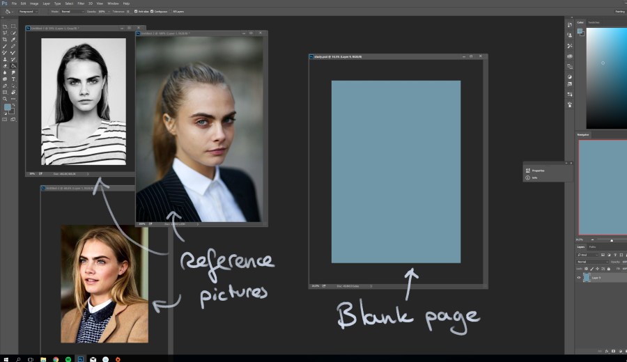
Pick a subject to draw (Cara Delevigne here as an example) and choose a suited picture to use as reference. Next to it, I open a large blank document (30cm x 42 cm in 300 DPI) and pick a muted colour ( I always opt for blue) as background.
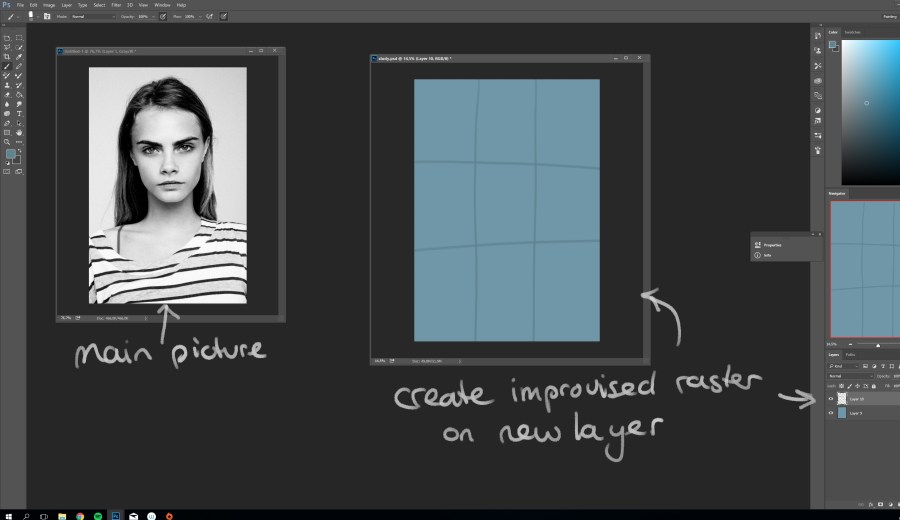
Once you have picked your reference photo, create an improvised raster on a new layer in the blank document. This helps set out your basic shapes and proportions.
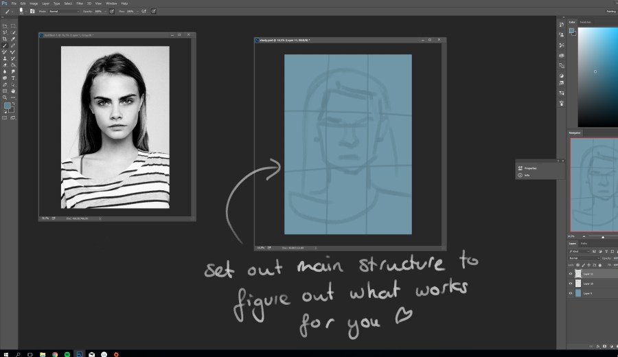
Before I set my timer, I lay out my basic lines to see where my outlines are going to be, otherwise I will be struggling to keep the drawing within canvas borders.
 Set you timer to 20 minutes and do not pay attention to the time! The first few times you will struggle to keep up with your set ‘deadline’, but the more you practice, the faster you get.
For tutoring purposes, I will post my set time to explain what I draw/do in the time given. 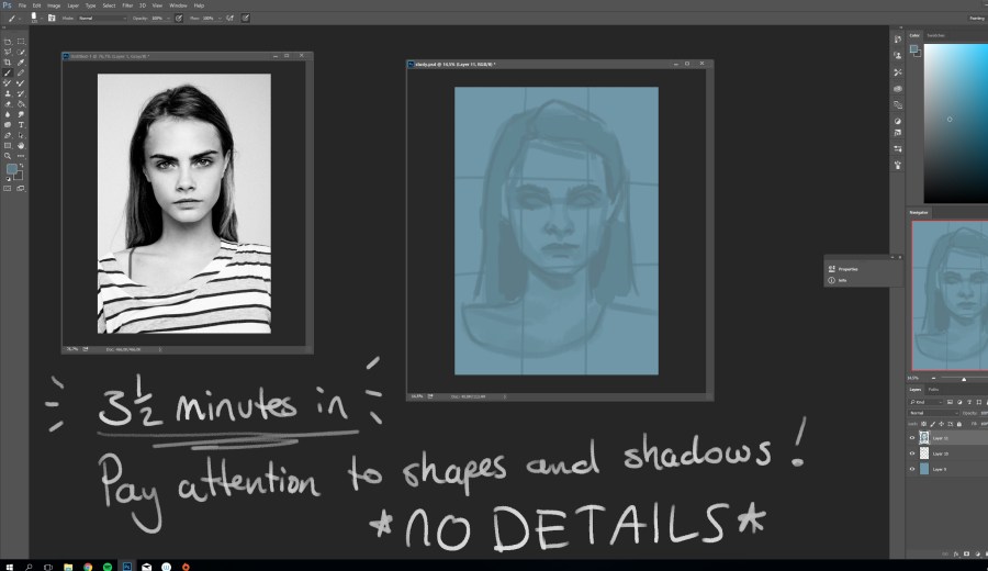
The first 3 to 4 minutes are important drawing your basic shapes and shadows. Highlights I usually add at the end, because they add more detail to a portrait. And given your time limit, I would recommend adding details at the end! Otherwise you could get preoccupied in drawing details, hence forgetting your 20 minute deadline 😉 .
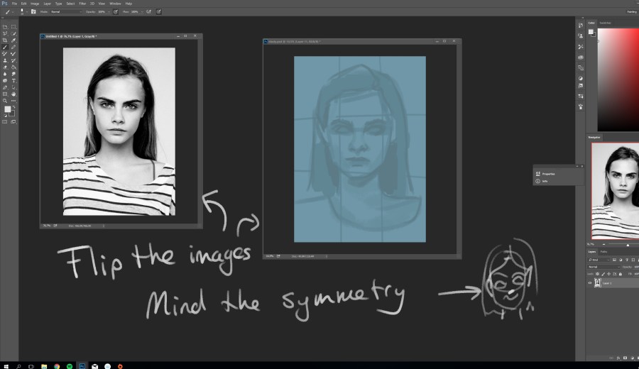
At this point I often flip my image to scan for any assymmetry I would otherwise overlook. Adjust these flaws for only a couple of minutes.
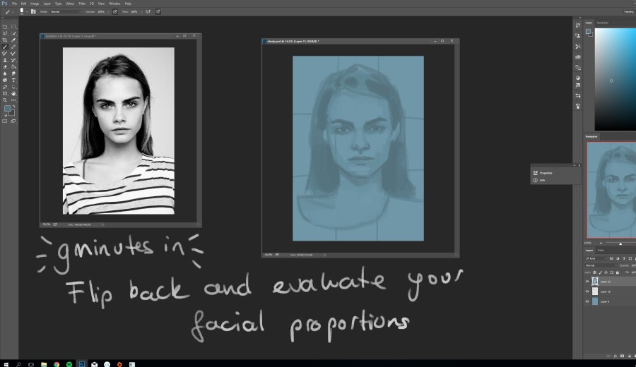
Flip you images back to the original lay-out and re-evaluate your facial proportions. At this moment I noticed that her face was a bit to wide.
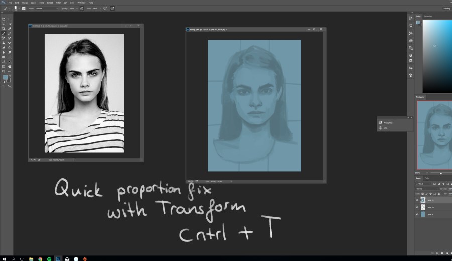
Quick fix with the transform function and keep on drawing! At this point I darken my shadows and start adding highlights. Do not think to much about it, just go with it. That timer is going to beep soon!
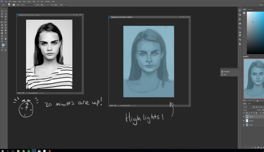
This was my result after 20 minutes. It is not perfect, but then again, it is not supposed to be perfect since it is a study! This is the way we learn, peeps. Just keep on drawing and drawing and practicing and studying…
For aesthetics sake, I edit my pictures just a little bit, as you can see in the image below.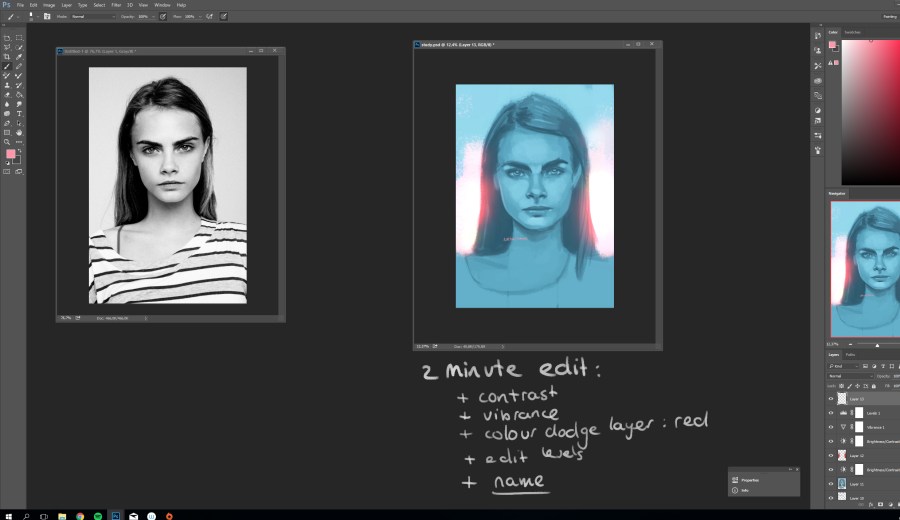
This does not take me more than 2 minutes; And I will add some more contrast, a colour dodge layer in a complementary colour, and some tweaking with levels and vibrance. That is it guys! Oh, and never ever forget to add your name.
Good luck with your studies! Would love to see yours 🙂
Love, Eve
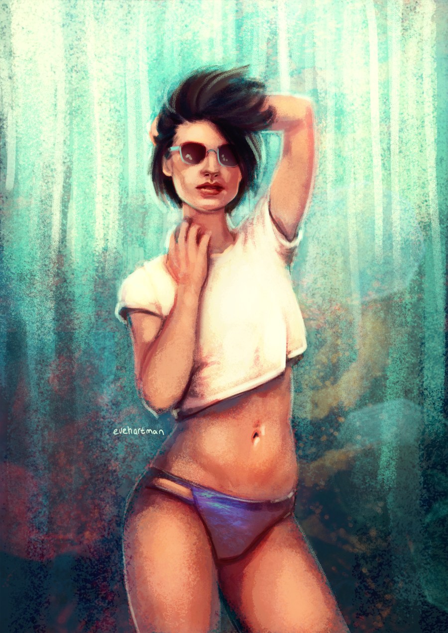
Hi there!
Here’s another short tutorial of my newest drawing. I will guide you through my art process step by step.
I always start with a base sketch where I lay out most of my values. Usually it will need some adjustments regarding anatomy or pose, but it is rhoughly finished. 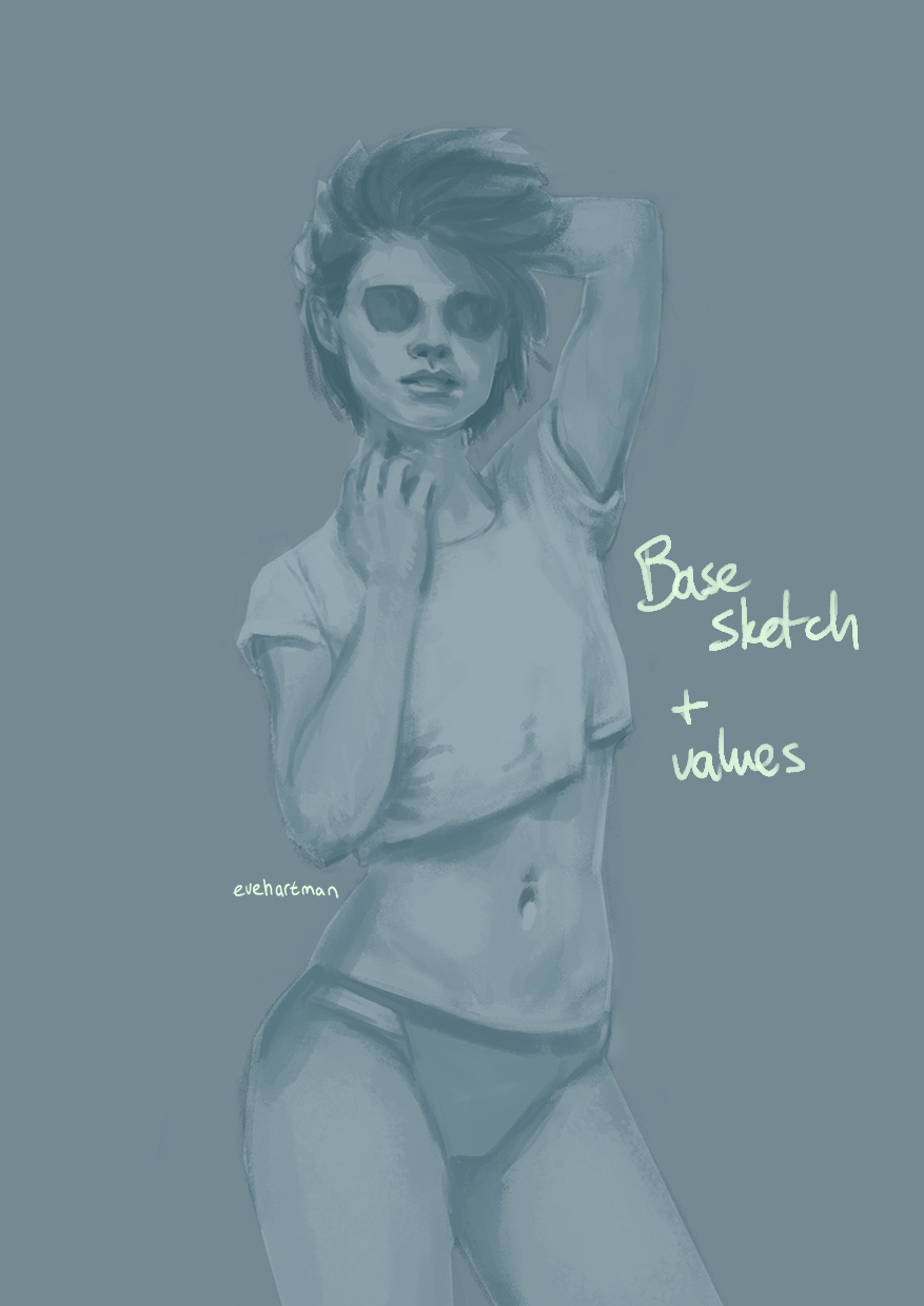
I also make sure the background has its base value, which makes it easier to adjust.
Next step is adding colours. I love this part, because you get to play around with the colour pallette! I often work on a soft layer for adding basic colours.
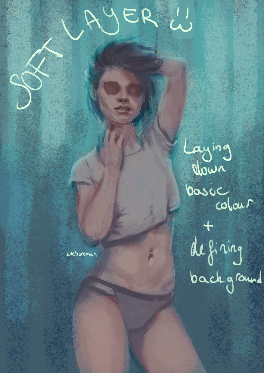
Again, pay attention to your background! I have a preference for textured backgrounds, as you can see in the image above. The top is a light colour, because I want my adience to focus on her face. 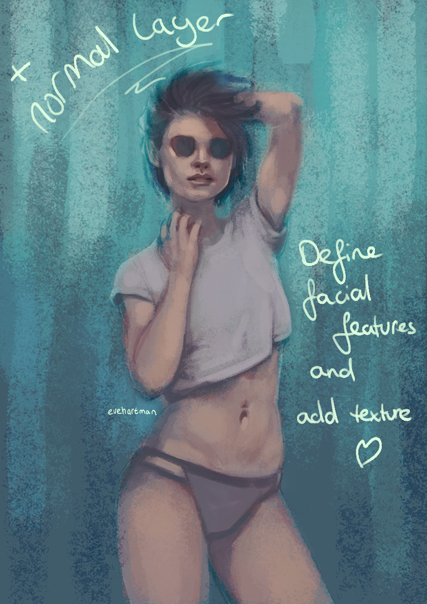
To adjust the colours you just applied, add a normal layer and start working with your shapes, making use of your colour picker (one of Photoshops best tools 🙂 ). This way, you work with the colours you already have, gradually defining the outlines of your artwork. 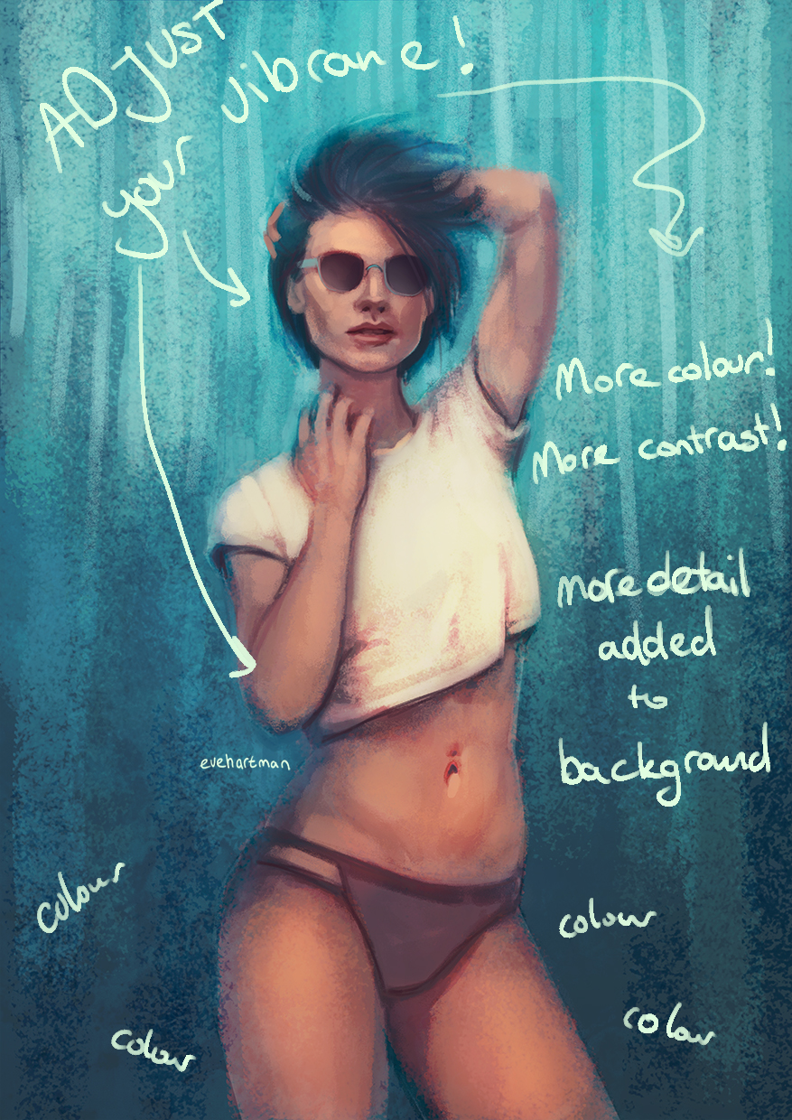
The vibrance adjusting guys! This helps me so much in perfecting my colours. Also, keep adjusting contrast and adding hinglights and shadows (as I did here with her shirt). It makes an object stand out more. Another trick I use influencing colours, is picking a basic colour (blue, red, yellow, purple, green, you name it) and filling a whole layer with it. Set this layer to lighten, colour dodge, overlay or soft layer to emphasize or dull out certain colours.
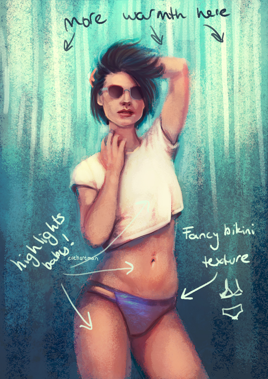
Work on your highlights! Most of the time I work with warm colours as highlights, and this drawing was no exception. In the image above, the bikini bottom has gotten a texture to add detail. You can easily apply textures by copying an image as a seperate layer on your artwork. Hit CTRL + T and go to the arch icon above your image ( view process in image below).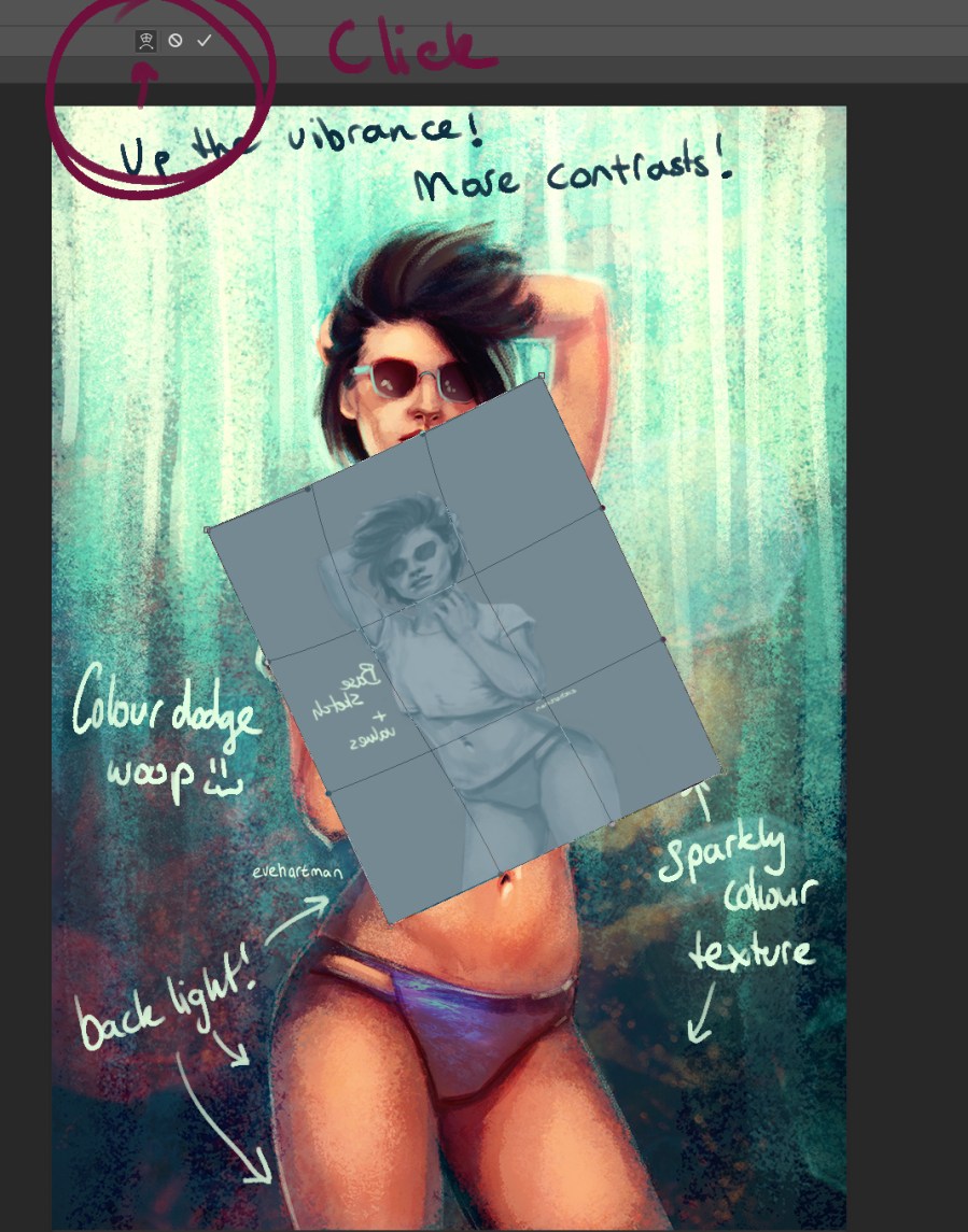
When you hit the warp option in Transform, it lets you shape the layer in any way you want. First, I make a layer more transparant to see how the folds in a piece of clothing flow. Follow the lines of the piece of clothing you want to add the texture to.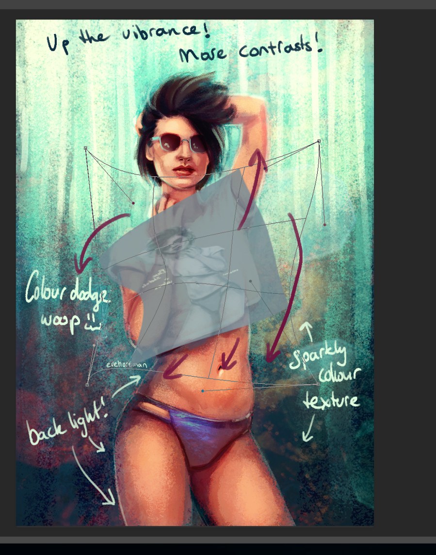
Set the layer to a blending mode of your choice (in the example picture below I used linear light) and start erasing the overlapping contours. I also erase a bit of the texture in the shadow part to let a texture ‘fade’.
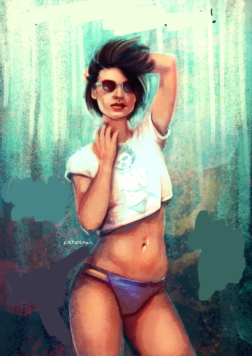
Lastly, I add an overall texture over my image in order to make my artwork a more cohesive piece. And I never forget to colour dodge. Add you last details (like backlights) in this step, but do not spend to much time on it!

Always add your name to a piece before publishing it online. And then you’re done!
Let me know what you think! Are there any requests for tutorials?
Love, Eve
