Hi there!
Here’s another short tutorial of my newest drawing. I will guide you through my art process step by step.
I always start with a base sketch where I lay out most of my values. Usually it will need some adjustments regarding anatomy or pose, but it is rhoughly finished. 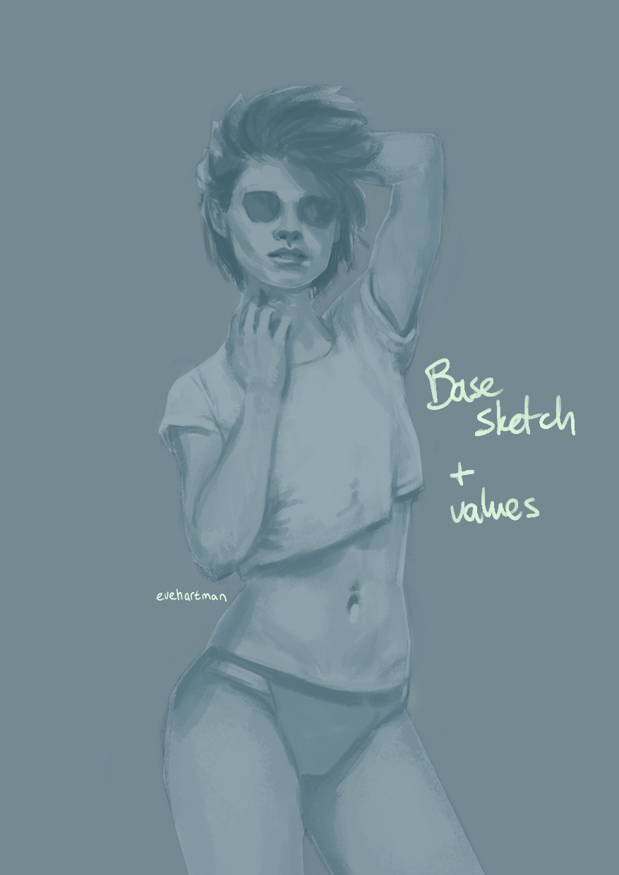
I also make sure the background has its base value, which makes it easier to adjust.
Next step is adding colours. I love this part, because you get to play around with the colour pallette! I often work on a soft layer for adding basic colours.
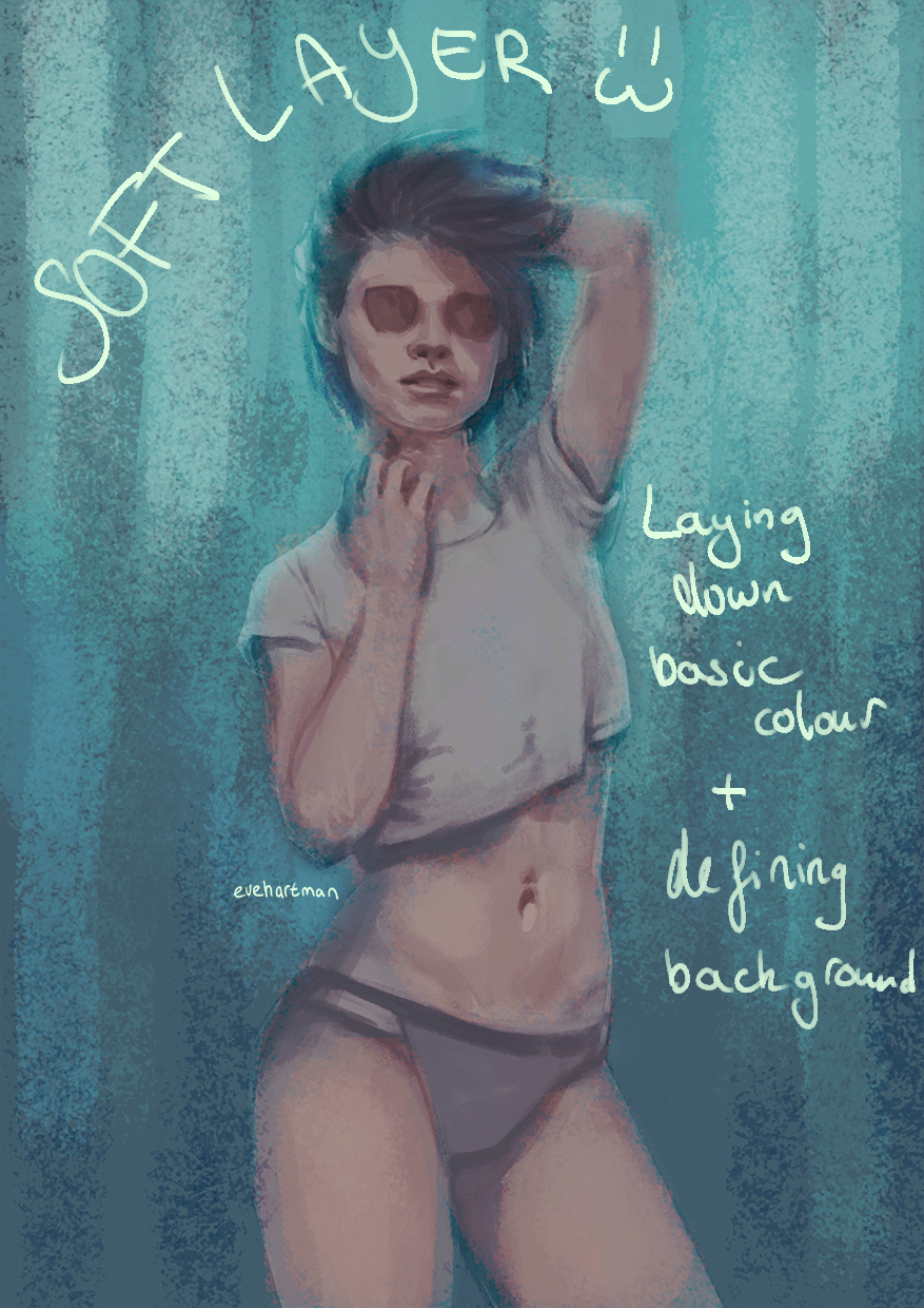
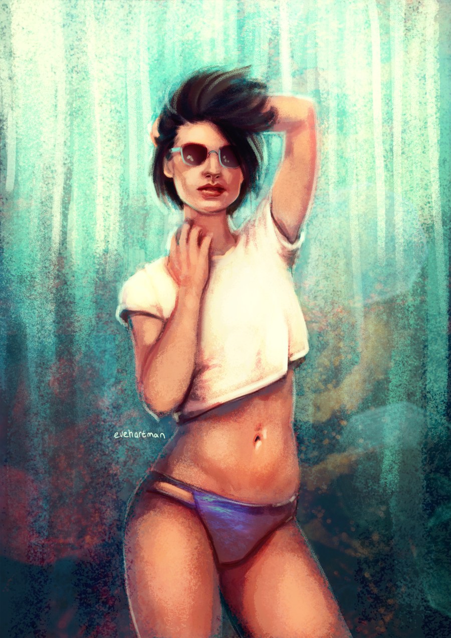
Again, pay attention to your background! I have a preference for textured backgrounds, as you can see in the image above. The top is a light colour, because I want my adience to focus on her face. 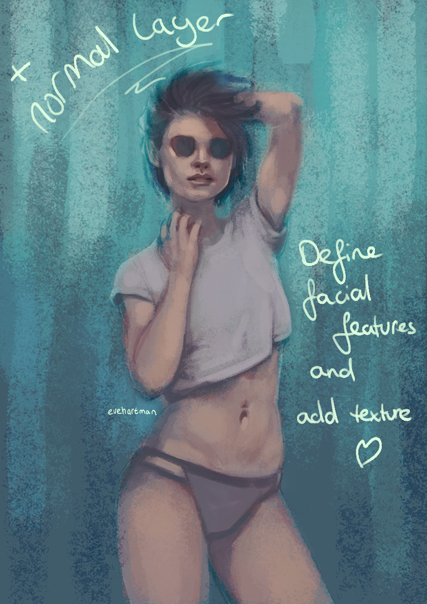
To adjust the colours you just applied, add a normal layer and start working with your shapes, making use of your colour picker (one of Photoshops best tools 🙂 ). This way, you work with the colours you already have, gradually defining the outlines of your artwork. 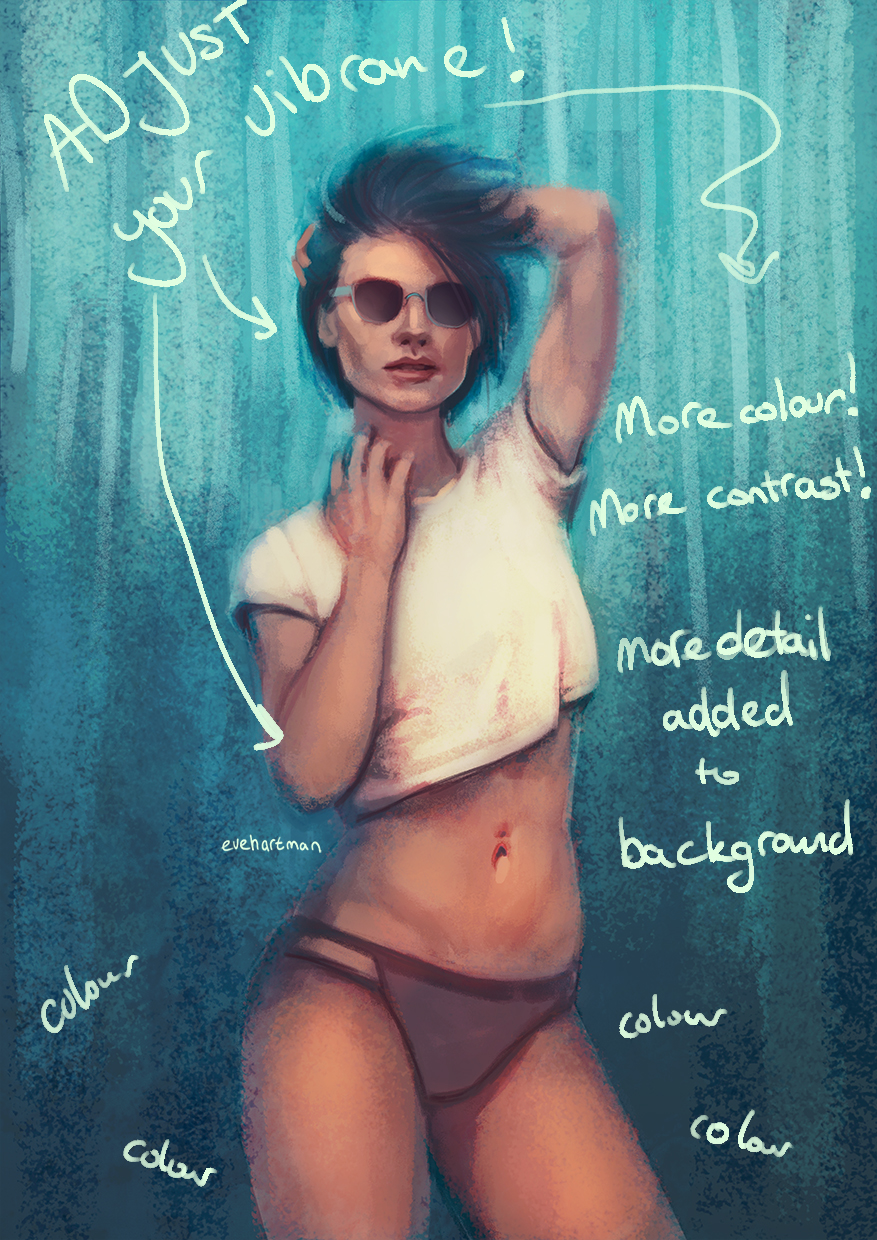
The vibrance adjusting guys! This helps me so much in perfecting my colours. Also, keep adjusting contrast and adding hinglights and shadows (as I did here with her shirt). It makes an object stand out more. Another trick I use influencing colours, is picking a basic colour (blue, red, yellow, purple, green, you name it) and filling a whole layer with it. Set this layer to lighten, colour dodge, overlay or soft layer to emphasize or dull out certain colours.
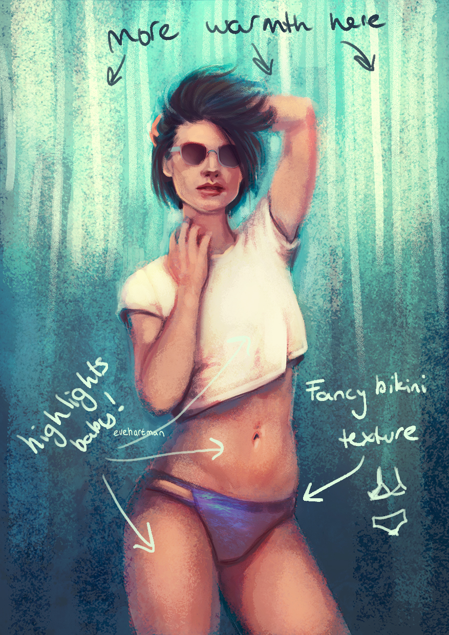
Work on your highlights! Most of the time I work with warm colours as highlights, and this drawing was no exception. In the image above, the bikini bottom has gotten a texture to add detail. You can easily apply textures by copying an image as a seperate layer on your artwork. Hit CTRL + T and go to the arch icon above your image ( view process in image below).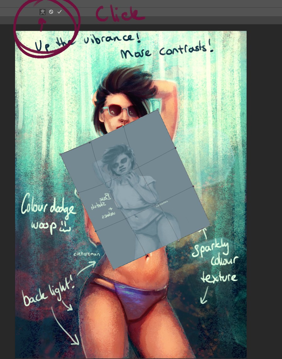
When you hit the warp option in Transform, it lets you shape the layer in any way you want. First, I make a layer more transparant to see how the folds in a piece of clothing flow. Follow the lines of the piece of clothing you want to add the texture to.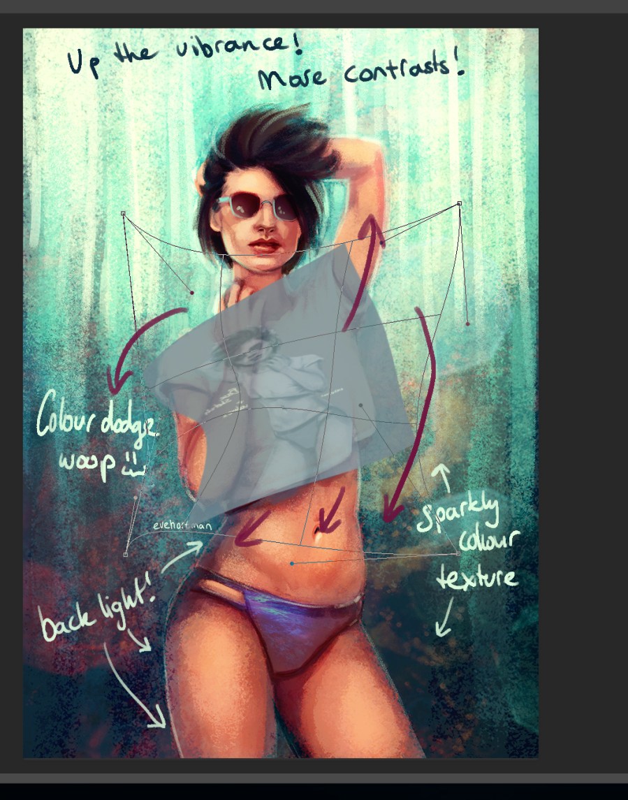
Set the layer to a blending mode of your choice (in the example picture below I used linear light) and start erasing the overlapping contours. I also erase a bit of the texture in the shadow part to let a texture ‘fade’.
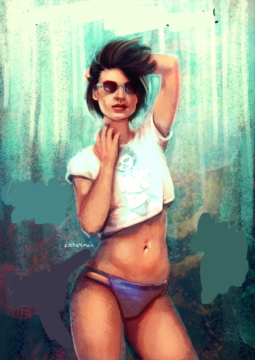
Lastly, I add an overall texture over my image in order to make my artwork a more cohesive piece. And I never forget to colour dodge. Add you last details (like backlights) in this step, but do not spend to much time on it!

Always add your name to a piece before publishing it online. And then you’re done!
Let me know what you think! Are there any requests for tutorials?
Love, Eve
