Original & Composition

Hello cuties!

Last tutorials we focussed on recreating an image, this time I will explain to you how to use references and composition to create a new, original piece.

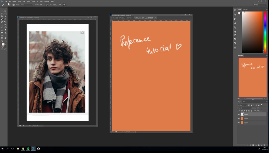
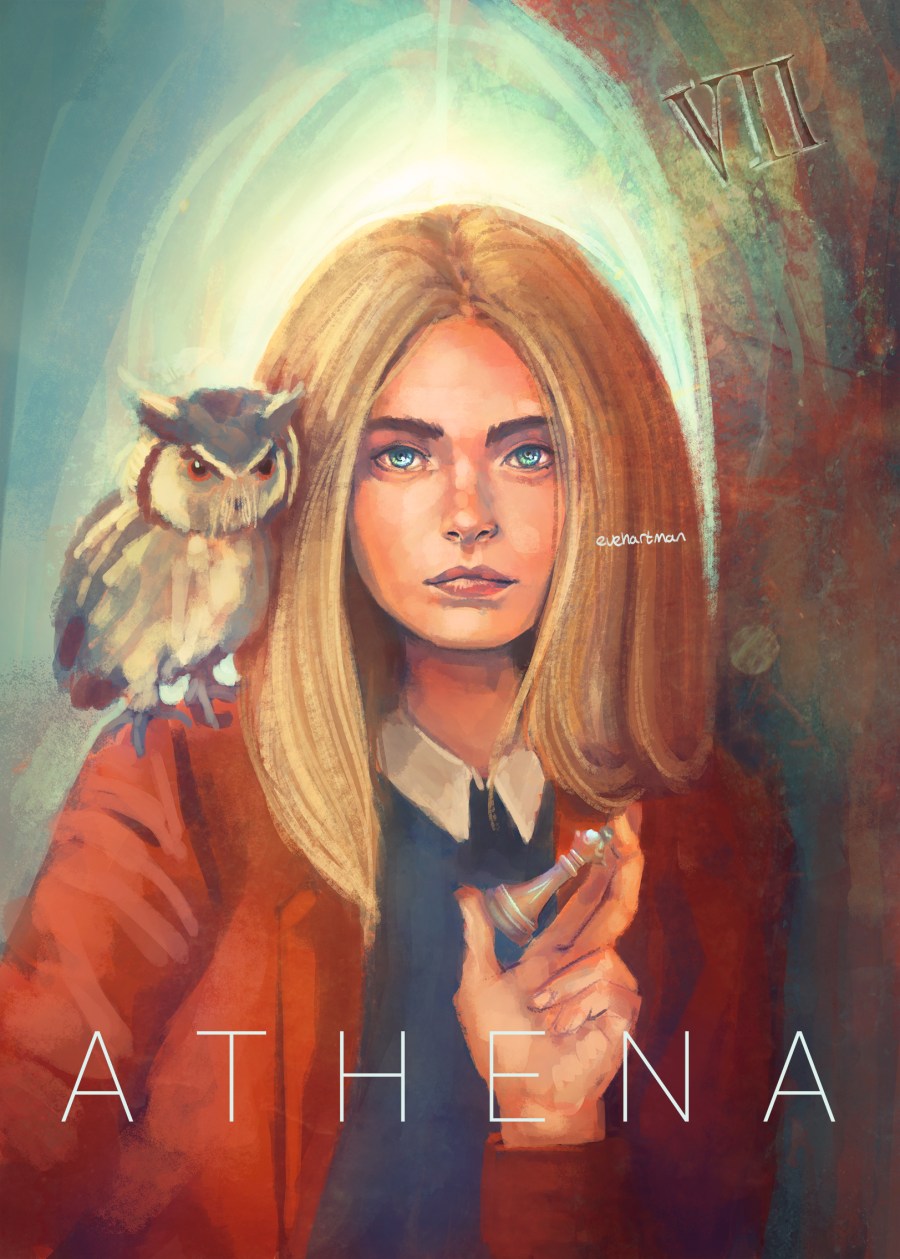
I wanted to create a modern version of the Greek Goddess Athena and found this great image of Cara Delevingne to serve as reference (the owl is so cute!).

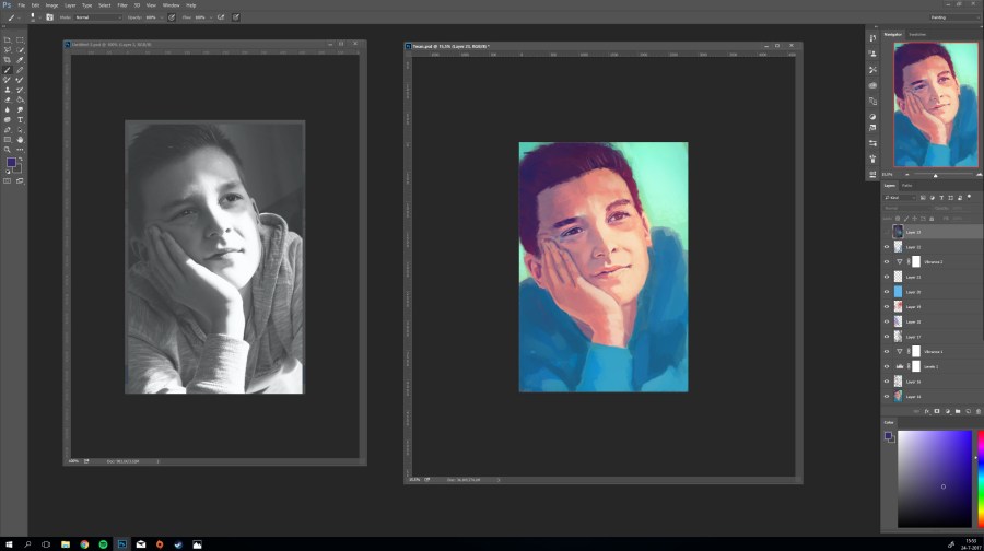
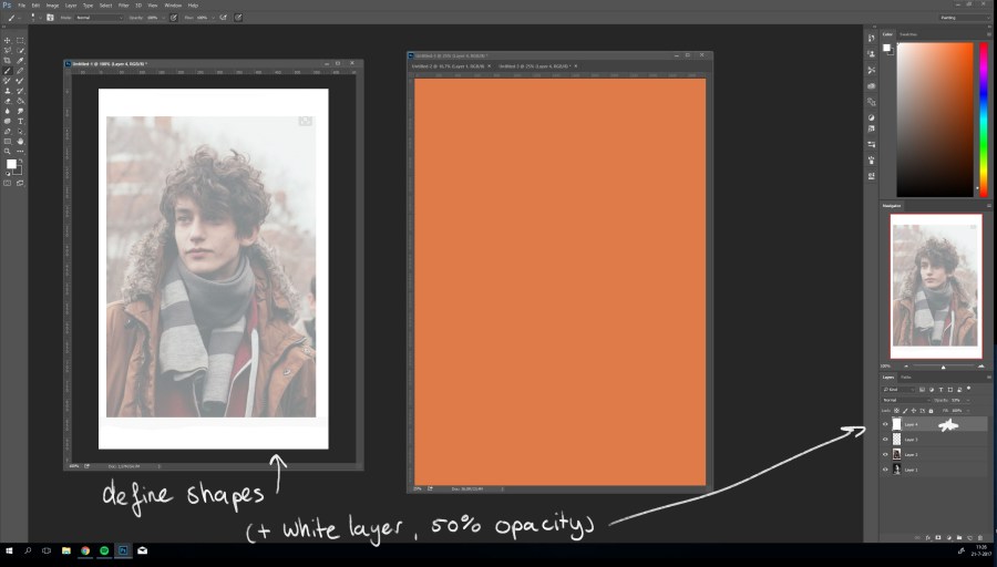
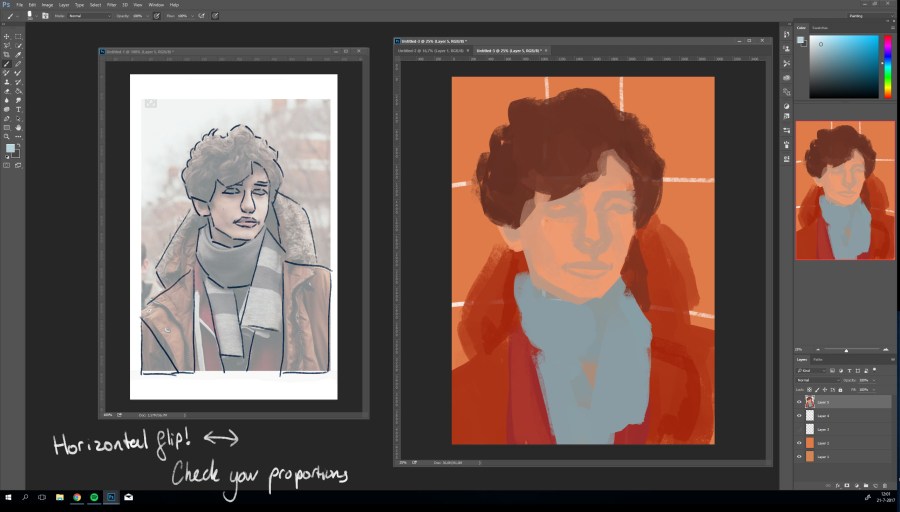
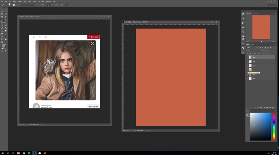
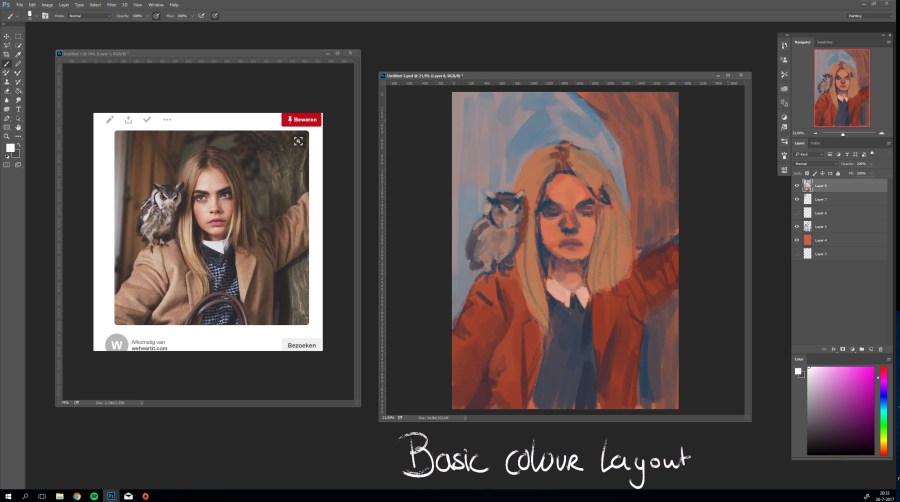
1. Open a blank document and set up your reference photo side by side. This document is 3000 x 4200 pixels with 300 DPI (to ensure high image quality). I choose an orange hue to ensure warm tones in my drawing.

0

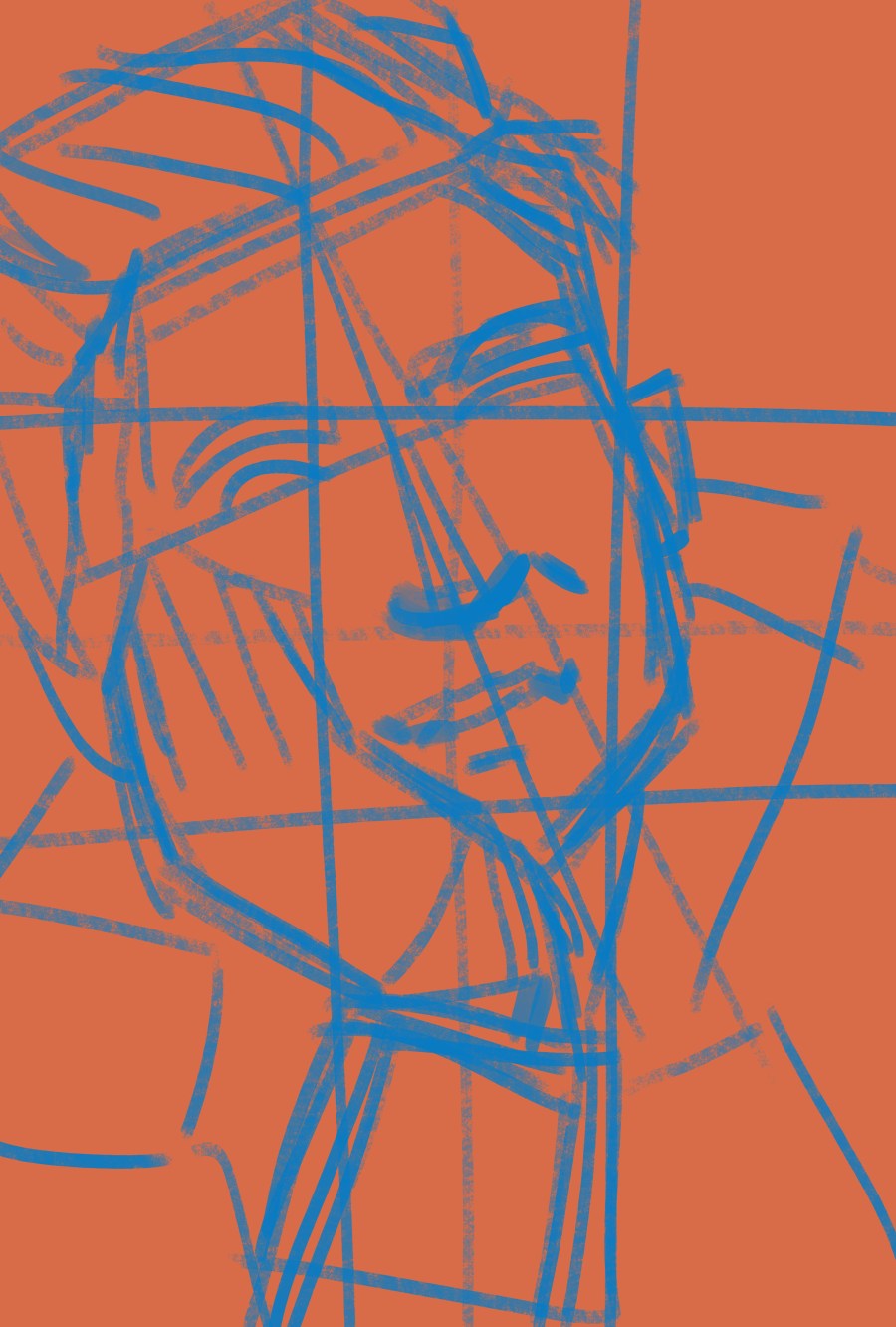
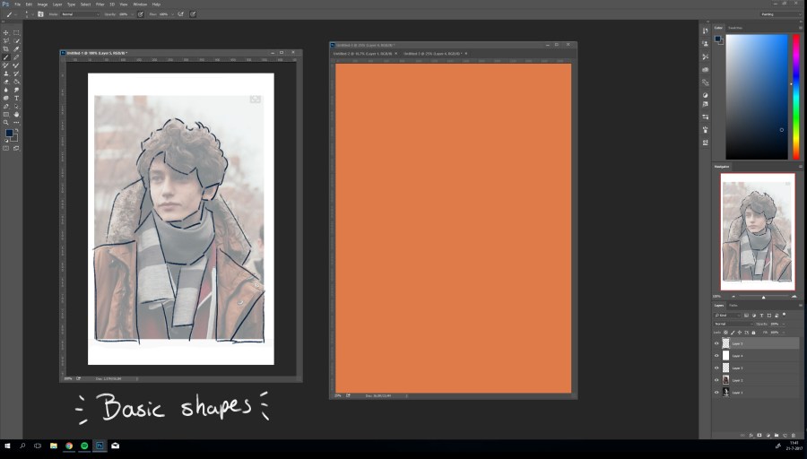
2. Lay down your basic lines and shapes. (For a reference tutorial click here: Reference tutorial )

1b

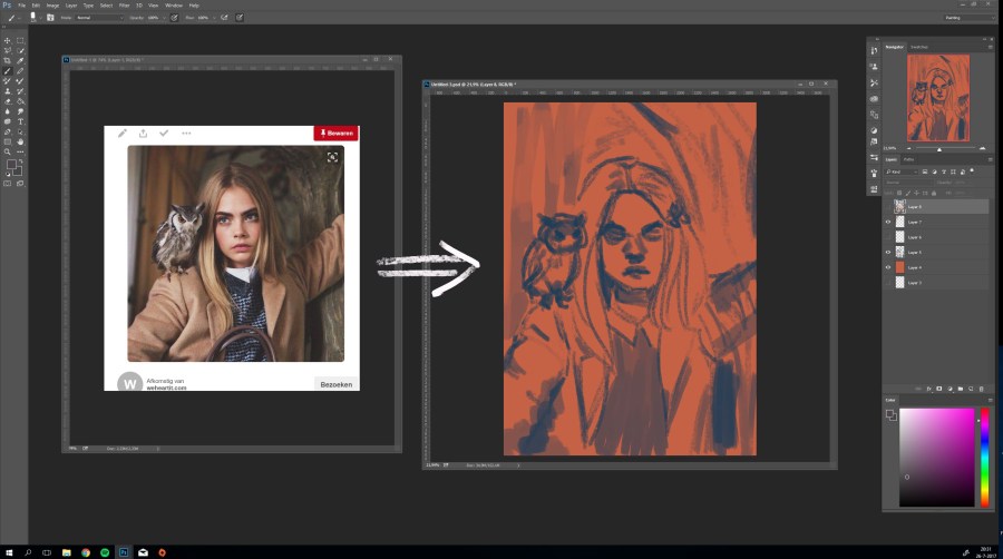
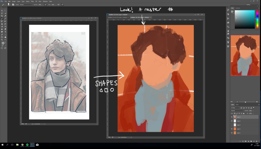
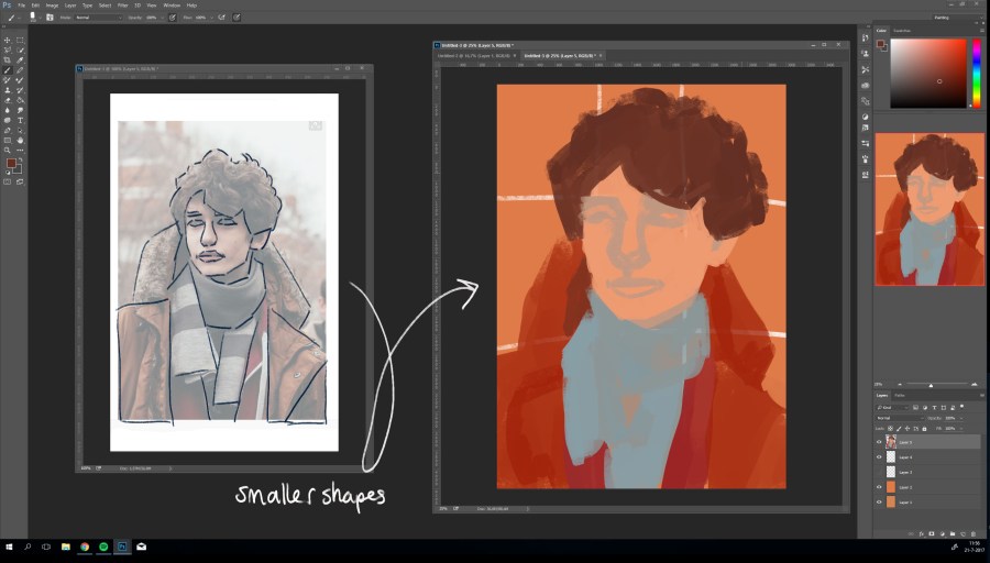
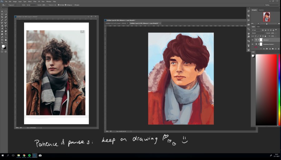
3. Determine your basic colours. As you can see, in the beginning I let the reference image guide my composition.

2

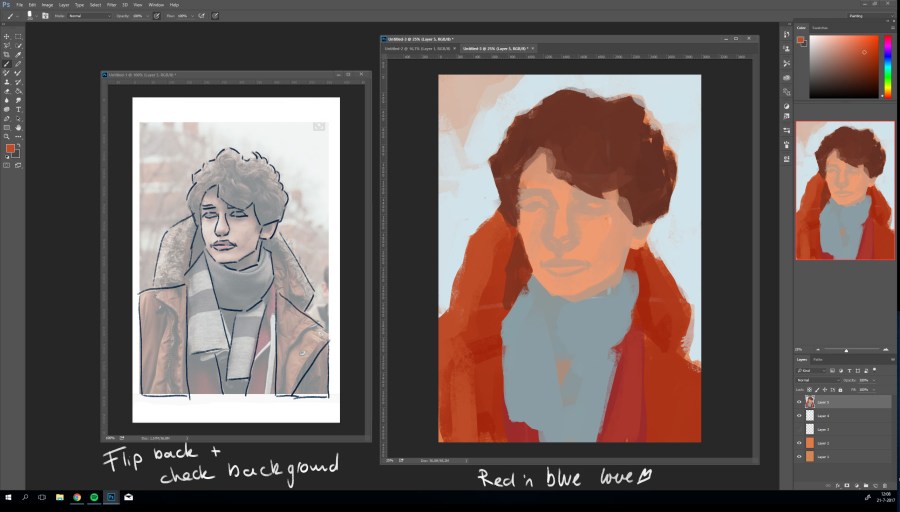
4. From here, I defined some facial details but decided not to ‘copy’ the exact features; my goal was to create a new image. The next step was adding new details. As Athena is the Goddes of strategy, I decided to add a chesspiece (the queen) in her left hand. This meant that her left arm had to be altered, I had to add a left hand and a chesspiece. Which means you have to look for references! I found my reference photos on Pinterest.

3

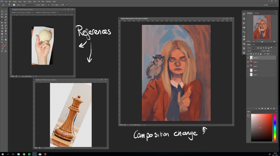
5. This is a tricky part: as you can see I tilted both pictures a bit to fit into the artwork (it is not necessary, but makes it easier). You can tilt them by using the Tranform option (CRTL + T). Paint your composition change on a new layer; when you mess up (which sometimes happens, no worries!), you can always delete the layer and start anew.

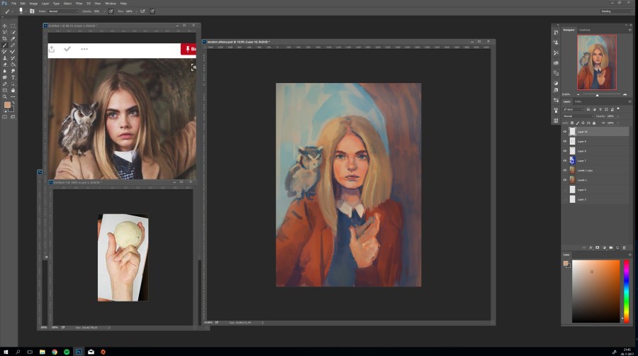
6. And keep drawing! The image below already shows the altered hand with the chesspiece.

4

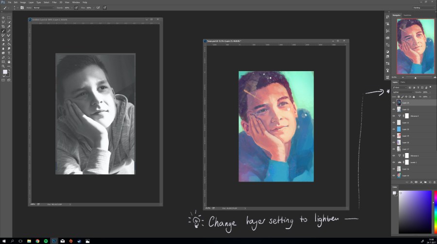
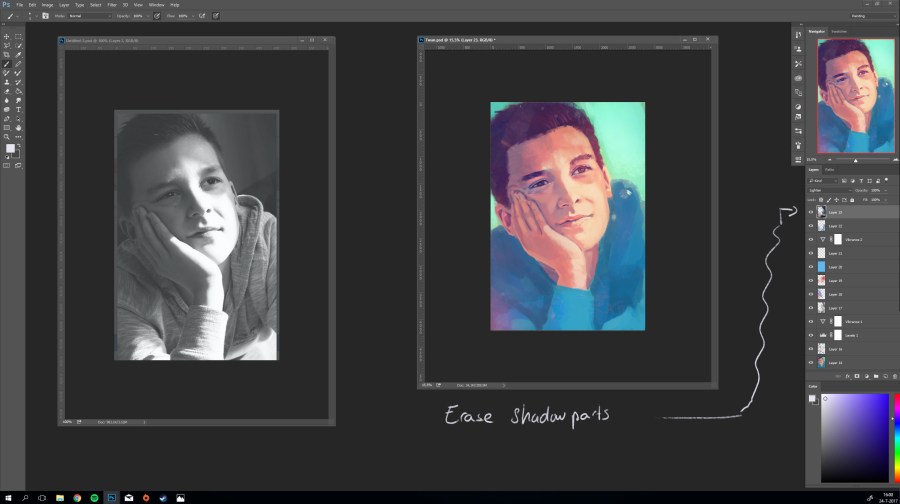
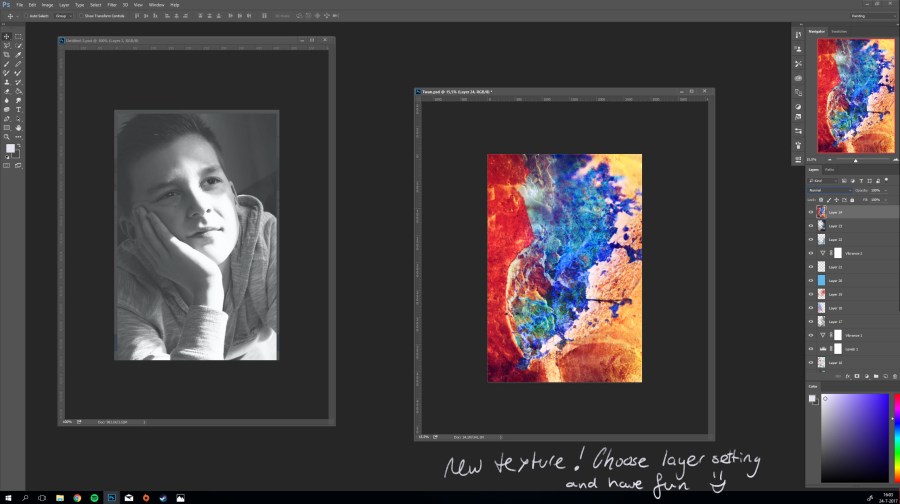
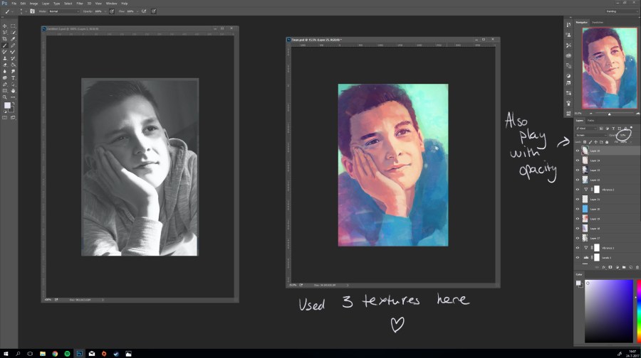
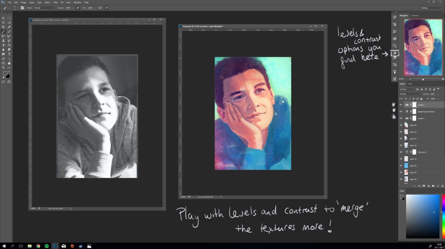
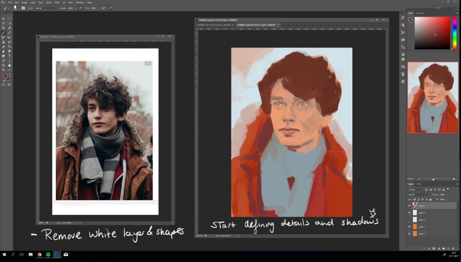
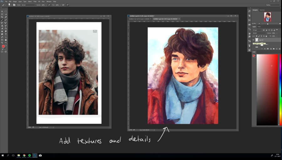
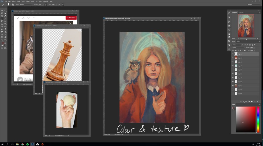
7. This is the part where I start adding my textures (for this tutorial click here: Texture tutorial ). Furthermore, I added a lighter colour in the background to add some perception of depth in the image.

5

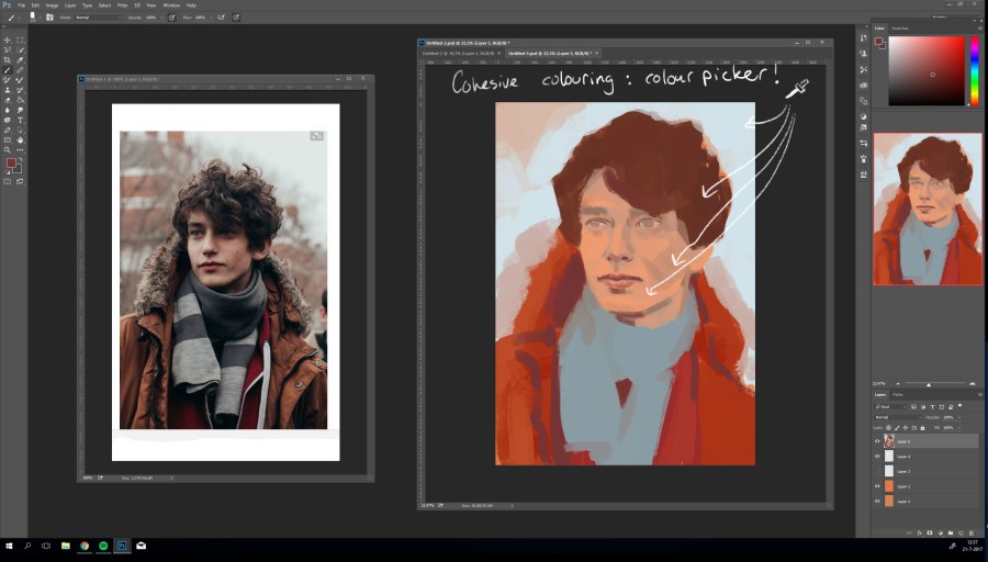
8. I felt like there was something missing in the image, like it could use another object or detail. To review the composition in your artwork, add a new layer and look at the basic shapes. I found there to be a radial component in the composition, as you can see in the image below.

6

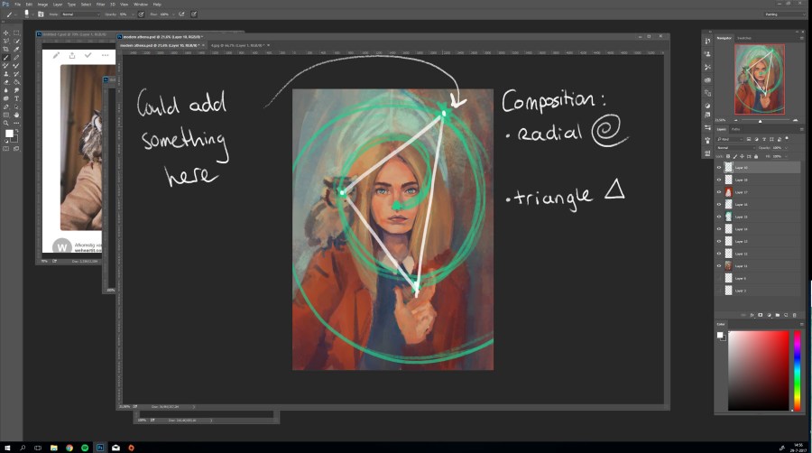
I determined the spot for the new detail by arranging a triangle in this radial. As you can see, her face falls exactly in the middle of this triangle. This means that eventhough you add another details to your artwork, attention will still be drawn to her face. This is important guys!

Another composition trick that always works is the usage of the golden ratio, otherwise known as phi (Φ, 1.618). This image below explains the basics of it (image source: Wikipedia):

A formula about the ratios translates to: {\frac {a+b}{a}}={\frac {a}{b}}\equiv \varphi . A bit complicated perhaps, but it comes down to this: if you create a canvas that is 10cm or inch high (side a), make it 16.18cm or inch wide (side a+b) (and yes, 1/ 0.618 = 1.618). In order to make the most pleasing composition, place your main subject somewhere at the line between a and b.

Let show this principle in these artworks (amazing artist is Ahmed Aldoori ):

golden ratio

This does not mean you have to use these principles! Most artists compose their subjects intuitively at the golden ratio. Use these tips if you want to revise your composition.

8. I placed a roman number 7 (VII, one of the symbols of Athena) at the indicated spot. I then continued drawing.

7

9. This is what I ended up with!

modern athenasm

I hope you liked it! If you have any requests for a next tutorial, please let me know in the comments below 🙂

Love, Eve.


Texture tutorial

It is tutorial time!

This time, I will show you how I use textures in my artwork as a way to add colour and dynamics.

First, I start drawing my portrait until I think it is about 80% finished (see the steps below)

1. Start with a proportion and raster base

1

2. Pick your basic colours and lay them down.

2

3. Fill out lights and shadows and add a background colour

3

4. Keep defining your shapes

4

5. Alter your colours if you have to.

5

6. Keep drawing until you defined most details

7

Apart from the details in his sweater, this looks like a decent portrait already. That is when I usually apply my textures.

8

7. Textures can be found everywhere on the web; http://www.textures.com is only one example. However, in my opion Deviantart accounts supply you with the best textures.

I used the following textures for this portrait: Galaxy – Primary – Lights

I started with the Galaxy print and copied it to a new layer

9

8. For the next step I set the layer setting to lighten; this resulted in a faded light texture on top of my artwork.

10

9. Erase the bits that bother you, parts where you don’t want lights such as skin, shadow parts.

11

10. You can start drawing from this part on if you want to; but most of the times I add about two or three textures layers and play with it for a bit.

12

13

11. It is imported to change your settings a bit to “merge” your textures more: I up the contrasts a bit and change the levels.

14

11. You go from this:

7

To this:

15

More colours ánd more dynamics.

12. I add a new layer and start painting on top of the textures. The importance here is that you just go with it; do not think about it to much!

This was my final result:

Twansm

I find the use of textures very helpful in composing exillerating and fresh artworks.

Let me know if this helps you!

Love, Eve

Reference tutorial

Hello sweeties 🙂

This step by step tutorial will show you my approach on drawing portraits from (photo) references. I hope this will help you with your art!

Reference photo’s I usually find on Pinterest (including this photo). 1

Set up your reference photo side by side to your blank  drawing document. This document is 3000 x 4200 pixels with 300 DPI (to ensure high image quality)2

1. Create a white layer on top of your reference picture and set it to 50 % opacity; this allows you to see the basic shapes of the photo. 3

2. Draw, with a dark colour, these basic shapes on top of the white layer. This makes it very easy to copy the shapes onto your drawing4

3. Start with a basic raster and start drawing the found shapes onto your canvas5

4. Look and see if you can find the smaller, more detailed shapes (usually the facial features) in the reference picture and draw these in both reference and your canvas 6

5. Flip it! Horizontally flip both images to check for any asymmetry and irregularities. Adjust them if necessary.7

6. Flip the image back and start working on your colours and background. As you see here, I went with the contrasting colours red and blue. 8

7. This is the moment you remove the white and lines layer from the reference picture and start defining the shapes and shadows. 9

8. Also pay attention to your colours! I always use my colour picker ; this will ensure you keep a balanced and cohesive colour palette. 10

9. You just have to keep on drawing; every once in a while, take a pause (drink something, do a little dance, whatever) and take a new and refreshed look at your painting: adjust the things that, at first glance, seem out of place . 11

10. When I am almost finished, I usually add some textures, change the lights a bit, adjust some colours and voilà! Portrait is done!12

refence

And your done! If you have any remaining questions, you can always comment them below 🙂

Have a lovely day!

Love, Eve


Site update coming soon

Hi guys!

I am currently busy updating my site. You will not notice on the site yet, but I will notify you guys when the new site is up!

I am planning a lot of new features on the site itself, hopefully making it an meeting place for artists☺️

Keep on checking in to see posts about the new features😁

Love, Eve