Hi there fellow artists!
I promised new tutorials of how to paint digitally, so here’s a quick step by step of my colouring process. I used a reference photo of Kiersey Clemons on this one. 
First, I paint a base, a value drawing that contains most of the details, resembling the refence picture. Usually this value painting is either painted in blue or green hues, because I prefer my shadowcolours in a cool tone, but you can choose whichever colour you like. You should end up with something like this:

As you may have noticed the dark areas are more detailed than the light spots in the drawing. I do this on purpose, because during the colouring process I add more lights than shadows. Make sure you merge the whole painting to one layer.
The next step is to create a new layer and set it to soft light, as seen in the picture below:
Paint on top of your value base with bright colours, using a soft brush: 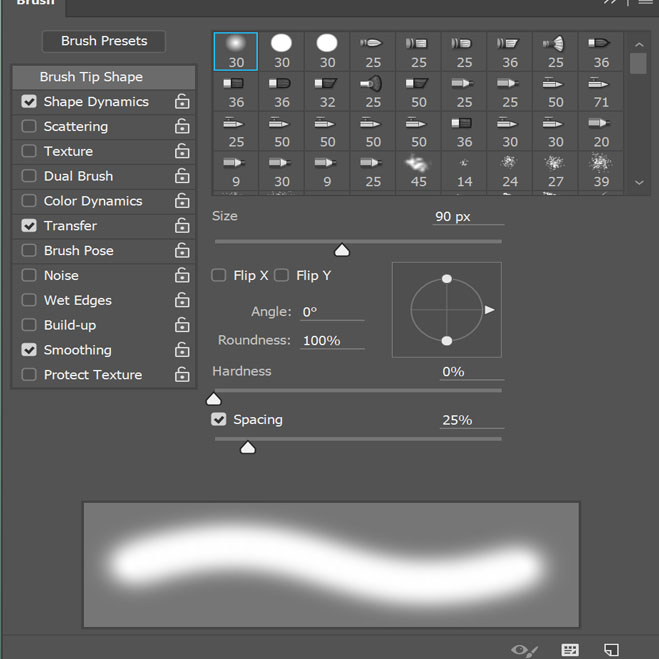
This way, you can gradually add colour to your base. Make sure the colours of the figure do no ‘bleed’ to much into the background, this can make the whole look messy. I ended up with a slighly coloured base like this, laying down my basic colours:

Looks like something already, doesn’t it? Now, for your next step, a very important one, you should choose direction: which colours should be emphasized, which colours not? Check out a colourwheel before doing this:
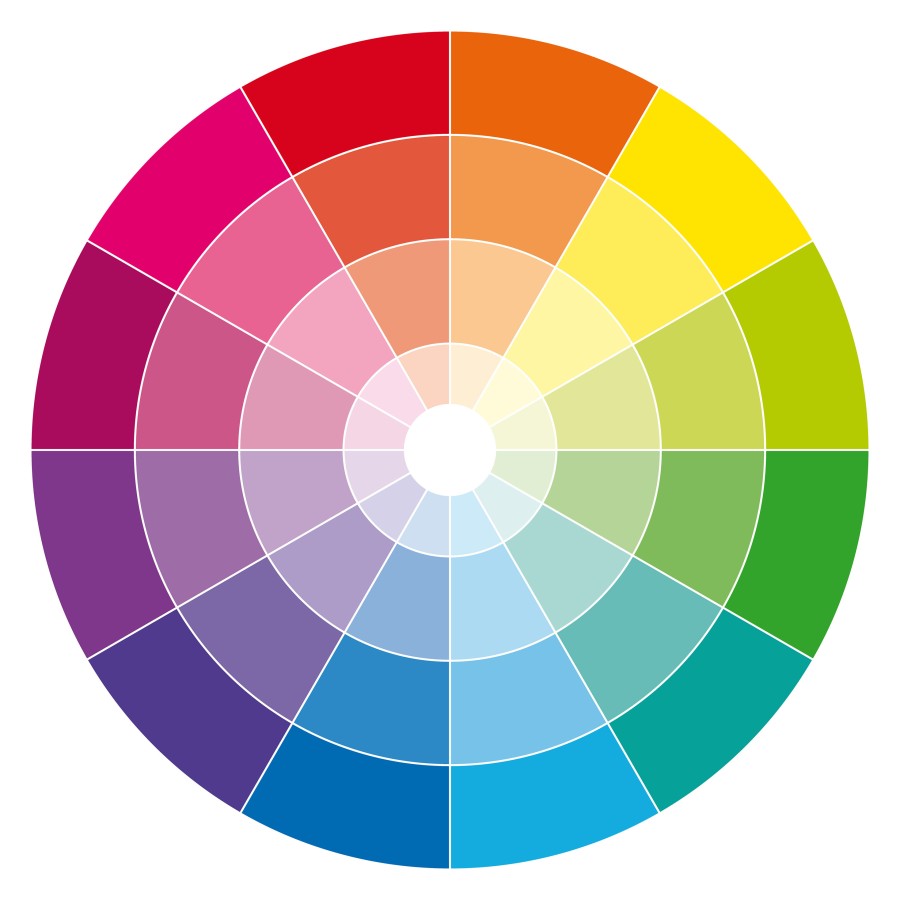
I like to use complementary colours – colours who are on opposite sides of the wheel; this makes an artwork stand out more.

Her skin should be a red, orange tone whereas I know her shirt and short are blue, so I should emphasize on these colours. Luckily, they are complemantary, as seen above.
I bring out the colours even more by using Vibrance, an option in Photoshop, to be recognized by these icons:
I do not play with the saturation, solely the vibrance; in my opinion a drawing loses the values when one oversaturates.

At this stage I also play with colour dodge a lot, which brightens the colours even more. I already made a tutorial about colour dodge, you can view it here: Colour dodge.
Eventually, my drawing looks like this:
A harmonic colour play between the warm red tones of the skin and the cool contrast of the clothing and the background. As you might notice, in the artwork the shawdows are a cool tone, and the midtones and lights a warm tone. Again, complementary. It is important stuff, guys.
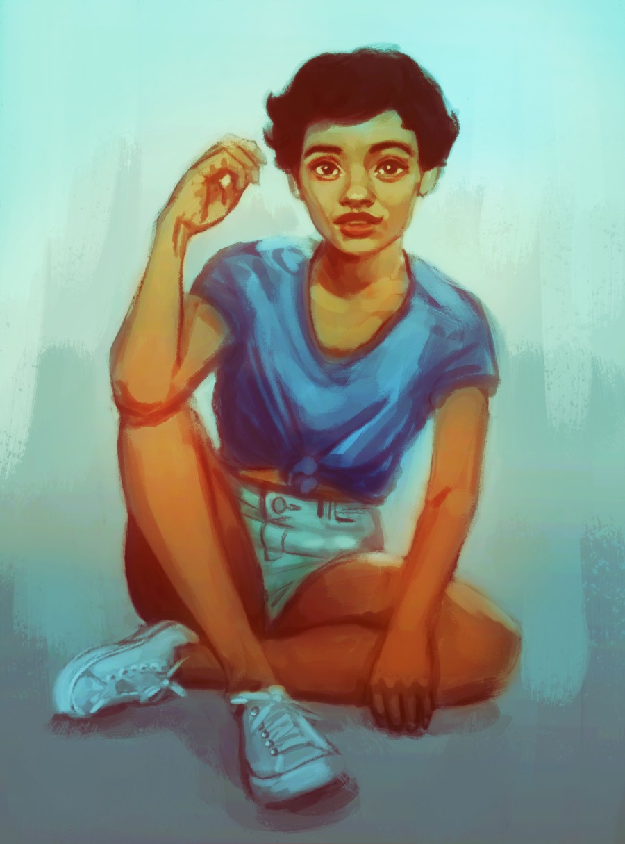
Now comes the fun bit: keep playing and experimenting with it! I often add more colour layers in soft light and colour dodge, and use the vibrance tool even more. Add textures to backgrounds to make them more interesting and strenghten the lights and shadows. This was my end result:

Her red lips became a focal point because they set off against the blue tones in the background, the blueish shadows on her legs bring up the attention to the more orange arms, face. The bottom of the drawing is of a blue hue, the top a yellow one. All tips and tricks to emphasize her face.
I hope you find this tutorial usefull! Please, if you have any questions, do not hesitate to ask 😉
Love, Eve
